Skip to product information
1 of 4

Asher Levine

Diamond Tote Bag

Regular price $1,295 USD
Regular price Sale price $1,295 USD
Sale Sold out
Shipping calculated at checkout.
Quantity

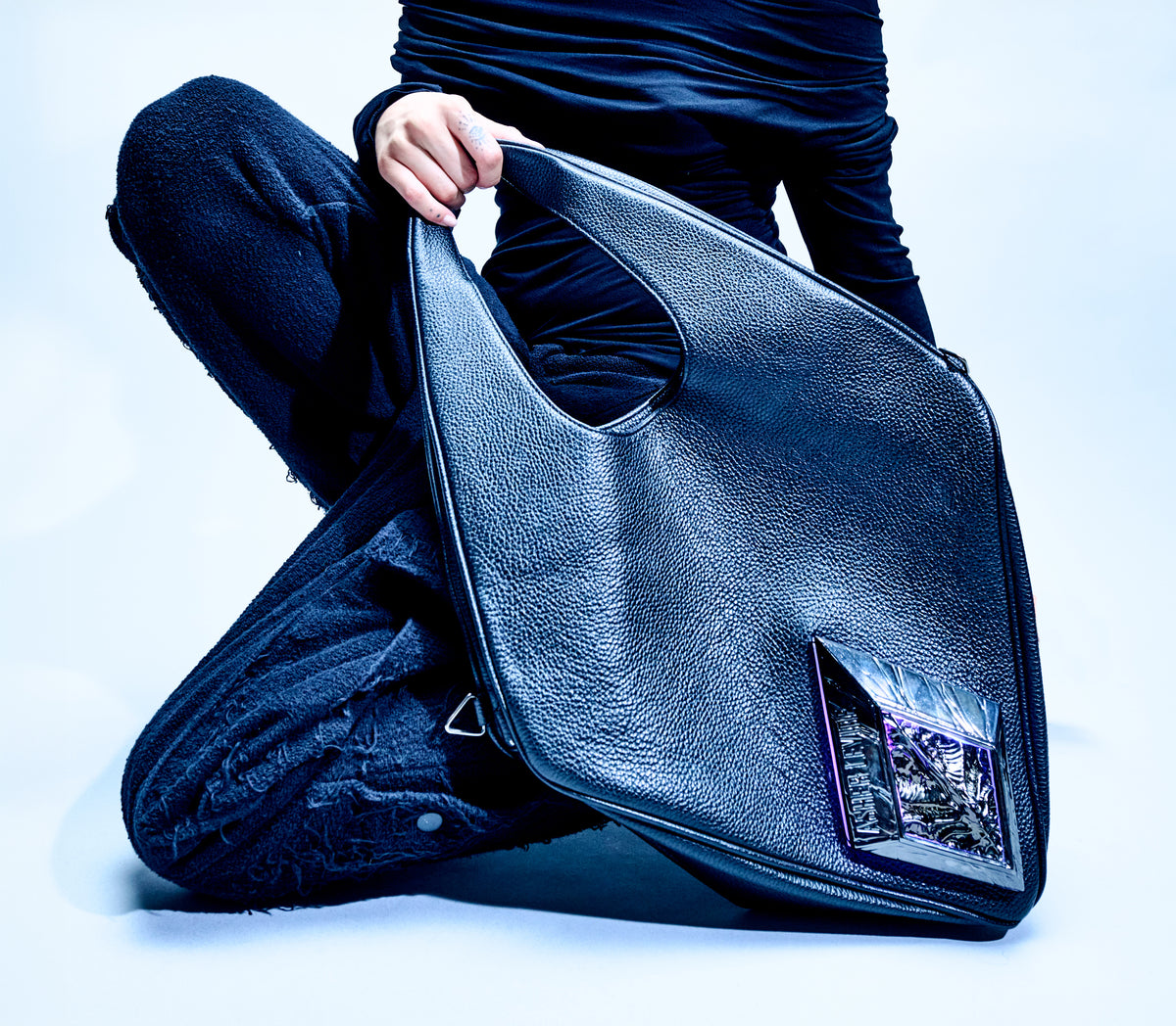
Asher Levine’s signature leather tote is crafted in Los Angeles from full-grain Italian hide and built around a sculptural diamond silhouette. The integrated illumination system adds programmable color and motion, transforming the bag from a functional carryall into an illuminated object with a distinct technical presence.

Product Features

  • First edition
  • Full-grain Italian leather
  • Removable leather strap
  • Internal zip pocket
  • Integrated illumination system
  • Customizable colors and animations
  • Made in Los Angeles
  • Dimensions: 24 × 14 × 5 inches

First Edition Exclusives

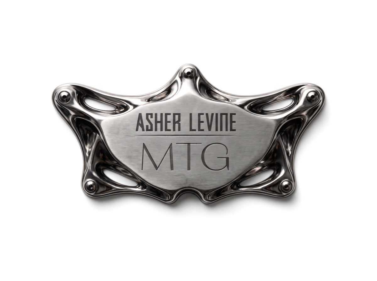
  • Metal inner plaque, engraved with your monogram / initials
  • First Edition ALien Shard
  • Numbered AL First Edition metal plate charm
View full details

Asher Levine / Diamond Tote

Form.

Light.

Presence.

SCULPTURAL LEATHER | DISTINCT ILLUMINATION

Scroll down

.al-product-story-section { --al-line: rgba(var(--color-foreground), 0.2); position: relative; isolation: isolate; overflow: hidden; background: rgb(var(--color-background)); color: rgb(var(--color-foreground)); } .al-product-story-section * { box-sizing: border-box; } .al-richtext > * { margin-top: 0; } .al-richtext > *:last-child { margin-bottom: 0; } .al-story-page { max-width: 1440px; margin: 0 auto; padding-inline: 40px; } .al-section-content { position: relative; z-index: 1; } .al-section-background { position: absolute; z-index: 0; inset: 0; pointer-events: none; overflow: hidden; background: var(--al-bg-color); } .al-section-background img, .al-section-background video { width: 100%; height: 100%; display: block; object-fit: var(--al-bg-fit); object-position: var(--al-bg-position); } .al-section-background::after { content: ""; position: absolute; inset: 0; background: var(--al-overlay-color); opacity: var(--al-overlay-opacity); } .al-eyebrow { margin: 0; text-transform: uppercase; letter-spacing: .17em; font-size: 9px; } .al-eyebrow > *,.al-story-label > *,.al-story-value > *,.al-media-caption > * { margin: 0; } .al-story-heading { font-family: var(--font-heading-family); font-style: var(--font-heading-style); font-weight: var(--font-heading-weight); font-size: clamp(42px, 5vw, 72px); line-height: .95; letter-spacing: -.04em; margin: 18px 0 28px; color: inherit; } .al-story-heading > * { margin: 0; font: inherit; letter-spacing: inherit; line-height: inherit; } .al-story-rte { max-width: 560px; color: rgba(var(--color-foreground), .74); font-size: 14px; line-height: 1.72; } .al-story-rte p { margin: 0; } .al-story-label { display: block; text-transform: uppercase; letter-spacing: .13em; font-size: 9px; margin-bottom: 8px; } .al-scroll-segment { height: 430vh; overflow: visible; } .al-scroll-sticky { position: sticky; z-index: 1; top: 0; height: 100vh; height: 100svh; overflow: hidden; background: rgb(var(--color-background)); } .al-scroll-segment.al-has-custom-bg .al-scroll-sticky { background: transparent; } .al-scroll-stage { position: absolute; inset: 0; opacity: 0; transform: scale(1.02); will-change: opacity, transform; } .al-scroll-pair { display: grid; grid-template-columns: 1fr 1fr; width: 100%; height: 100%; } .al-scroll-video,.al-scroll-fallback { width: 100%; height: 100%; display: block; object-fit: cover; } .al-scroll-shade { position: absolute; inset: 0; background: linear-gradient(180deg, rgba(0,0,0,.2), rgba(0,0,0,.04) 35%, rgba(0,0,0,.1) 68%, rgba(0,0,0,.5)); pointer-events: none; } .al-scroll-copy { position: absolute; z-index: 2; inset: 0; display: grid; place-items: center; text-align: center; padding: 32px; } .al-scroll-heading { font-family: var(--font-heading-family); font-size: clamp(46px,6vw,90px); line-height: .92; letter-spacing: -.045em; margin: 0 0 22px; color: inherit; text-shadow: 0 2px 26px rgba(0,0,0,.5); } .al-scroll-heading > *,.al-scroll-kicker > *,.al-scroll-subline > *,.al-scroll-hint > * { margin: 0; font: inherit; letter-spacing: inherit; line-height: inherit; } .al-scroll-kicker,.al-scroll-subline,.al-scroll-hint { text-transform: uppercase; letter-spacing: .17em; font-size: 9px; } .al-scroll-kicker { margin: 0 0 20px; }.al-scroll-subline { margin: 0; } .al-scroll-hint { position: absolute; z-index: 3; bottom: 26px; left: 50%; transform: translateX(-50%); opacity: .72; white-space: nowrap; } .al-editorial-section { padding: 96px 0; } .al-editorial-grid { display: grid; grid-template-columns: .75fr 1.25fr; gap: 70px; align-items: center; } .al-editorial-media { height: min(72vw,820px); position: relative; background: rgba(var(--color-foreground),.05); overflow: hidden; } .al-editorial-media img { width: 100%; height: 100%; object-fit: contain; padding: 5%; } .al-media-caption { position: absolute; right: 22px; bottom: 22px; background: rgba(var(--color-background),.88); padding: 12px 14px; text-transform: uppercase; letter-spacing: .13em; font-size: 8px; } .al-fact-grid { display: grid; grid-template-columns: repeat(3,1fr); border-top: 1px solid var(--al-line); margin-top: 42px; } .al-fact-grid > div { padding: 18px 14px 0 0; border-right: 1px solid var(--al-line); } .al-fact-grid > div + div { padding-left: 14px; }.al-fact-grid > div:last-child { border-right: 0; } .al-fact-grid .al-story-value { font-size: 11px; color: rgba(var(--color-foreground),.72); } .al-feature-grid { min-height: 880px; display: grid; grid-template-columns: .82fr 1.18fr; } .al-feature-copy { padding: 105px 62px 105px max(40px,calc((100vw - 1440px)/2 + 40px)); display: flex; flex-direction: column; justify-content: center; } .al-feature-media { position: relative; overflow: hidden; background: #111; } .al-feature-media > img,.al-feature-media > video { width: 100%; height: 100%; display: block; object-fit: cover; filter: brightness(.72) contrast(1.08); } .al-feature-media::after { content: ""; position: absolute; inset: 0; background: linear-gradient(90deg, rgba(var(--color-background),1), transparent 40%); } .al-feature-details { display: flex; gap: 34px; flex-wrap: wrap; border-top: 1px solid var(--al-line); padding-top: 20px; margin-top: 34px; } .al-feature-details .al-story-value { font-size: 11px; color: rgba(var(--color-foreground),.68); } .al-feature-badge { position: absolute; z-index: 2; width: min(var(--al-badge-width,200px),42vw); transform: rotate(var(--al-badge-rotation,0deg)); } .al-feature-badge--bottom-right { right: 7%; bottom: 8%; }.al-feature-badge--bottom-left { left: 7%; bottom: 8%; }.al-feature-badge--top-right { right: 7%; top: 8%; }.al-feature-badge--top-left { left: 7%; top: 8%; } .al-feature-badge--text { aspect-ratio: 1; border: 1px solid rgba(var(--color-foreground),.42); border-radius: 50%; display: grid; place-items: center; padding: 14px; text-align: center; text-transform: uppercase; letter-spacing: .14em; font-size: 8px; } .al-feature-badge--image { isolation: isolate; } .al-feature-badge--image img { display: block; width: 100%; height: auto; object-fit: contain; } .al-feature-badge-label { position: absolute; z-index: 1; top: 50%; left: 50%; width: 72%; transform: translate(-50%,calc(-50% + var(--al-badge-text-offset,0px))); color: var(--al-badge-text-color,#fff); font-size: var(--al-badge-text-size,11px); line-height: 1.15; text-align: center; text-transform: uppercase; letter-spacing: .14em; } .al-craft-grid { display: grid; grid-template-columns: 1fr 1fr; min-height: 820px; } .al-craft-image { overflow: hidden; background: #111; }.al-craft-image img { width: 100%; height: 100%; object-fit: cover; transform: scale(1.35); filter: grayscale(1) contrast(1.15) brightness(.62); } .al-craft-copy { padding: 96px max(40px,calc((100vw - 1440px)/2 + 40px)) 96px 76px; display: flex; flex-direction: column; justify-content: center; } .al-detail-list { list-style: none; padding: 0; margin: 36px 0 0; border-top: 1px solid var(--al-line); } .al-detail-list li { display: grid; grid-template-columns: 135px 1fr; gap: 24px; padding: 15px 0; border-bottom: 1px solid var(--al-line); } .al-detail-list li .al-story-value { font-size: 12px; color: rgba(var(--color-foreground),.72); } .al-details-section,.al-release-section { padding: 100px 0; } .al-section-head { display: grid; grid-template-columns: .82fr 1.18fr; gap: 70px; align-items: end; } .al-spec-grid { display: grid; grid-template-columns: repeat(6,1fr); border-block: 1px solid var(--al-line); margin-top: 56px; } .al-spec-grid > div { padding: 22px 18px; border-right: 1px solid var(--al-line); min-height: 104px; }.al-spec-grid > div:last-child { border-right: 0; }.al-spec-grid .al-story-value { font-size: 12px; } .al-release-grid { display: grid; grid-template-columns: repeat(3,1fr); margin-top: 58px; border-top: 1px solid var(--al-line); } .al-release-grid article { padding: 28px 28px 30px 0; border-bottom: 1px solid var(--al-line); }.al-release-grid article + article { padding-left: 28px; border-left: 1px solid var(--al-line); } .al-release-title { font-family: var(--font-heading-family); font-size: 25px; line-height: 1.08; margin: 0 0 16px; color: inherit; }.al-release-title > * { margin: 0; font: inherit; line-height: inherit; }.al-release-copy { font-size: 12px; color: rgba(var(--color-foreground),.72); } .al-delivery-grid { display: grid; grid-template-columns: repeat(3,1fr); margin-top: 36px; border: 1px solid var(--al-line); background: rgba(var(--color-foreground),.04); } .al-delivery-grid > div { padding: 20px 22px; border-right: 1px solid var(--al-line); }.al-delivery-grid > div:last-child { border-right: 0; }.al-delivery-grid .al-story-value { font-size: 11px; color: rgba(var(--color-foreground),.72); } .al-inquiry-section { min-height: 92vh; display: grid; grid-template-columns: minmax(0,.9fr) minmax(0,1.1fr); background: var(--inq-bg); color: var(--inq-text); } .al-inquiry-copy { padding: clamp(70px,8vw,140px) clamp(28px,6vw,100px); display: flex; flex-direction: column; justify-content: center; } .al-inquiry-heading { font-family: var(--font-heading-family); font-size: clamp(48px,6.2vw,96px); line-height: .88; letter-spacing: -.055em; margin: 18px 0 30px; max-width: 760px; color: var(--inq-text); }.al-inquiry-heading > * { margin: 0; font: inherit; letter-spacing: inherit; line-height: inherit; } .al-inquiry-body { color: var(--inq-muted); font-size: 14px; line-height: 1.65; max-width: 560px; }.al-inquiry-form { margin-top: 42px; max-width: 680px; }.al-inquiry-fields { display: grid; grid-template-columns: 1fr 1fr; gap: 18px; } .al-inquiry-form label { display: block; margin-bottom: 18px; }.al-inquiry-form label span { display: block; text-transform: uppercase; letter-spacing: .14em; font-size: 8px; margin-bottom: 8px; } .al-inquiry-form input,.al-inquiry-form textarea { width: 100%; border: 0; border-bottom: 1px solid color-mix(in srgb,var(--inq-text) 35%,transparent); background: transparent; color: var(--inq-text); padding: 10px 0; border-radius: 0; font: inherit; } .al-inquiry-form input:focus,.al-inquiry-form textarea:focus { outline: 0; border-color: var(--inq-accent); } .al-inquiry-form button { width: 100%; margin-top: 8px; background: var(--inq-accent); color: var(--inq-bg); border: 1px solid var(--inq-accent); padding: 20px 22px; display: flex; justify-content: space-between; text-transform: uppercase; letter-spacing: .14em; font-size: 10px; cursor: pointer; } .al-inquiry-product { margin: 14px 0 0; color: var(--inq-muted); text-transform: uppercase; letter-spacing: .12em; font-size: 8px; }.al-inquiry-success { border: 1px solid var(--inq-accent); padding: 15px; margin-bottom: 20px; } .al-inquiry-visuals { position: relative; min-height: 880px; background: #111; }.al-inquiry-image { position: absolute; overflow: hidden; }.al-inquiry-image img { width: 100%; height: 100%; object-fit: cover; filter: grayscale(1) contrast(1.08); } .al-inquiry-image--studio { inset: 0 0 0 12%; clip-path: polygon(12% 0,100% 0,100% 100%,0 100%); }.al-inquiry-image--portrait { z-index: 2; left: 0; bottom: 7%; width: 42%; height: 55%; border: 1px solid color-mix(in srgb,var(--inq-text) 35%,transparent); transform: translateX(-9%) rotate(-2deg); } @media (max-width: 990px) { .al-story-page { padding-inline: 22px; } .al-editorial-grid,.al-feature-grid,.al-craft-grid,.al-section-head,.al-inquiry-section { grid-template-columns: 1fr; } .al-editorial-grid { gap: 42px; }.al-feature-copy,.al-craft-copy { padding: 78px 24px; }.al-feature-media,.al-craft-image { min-height: 620px; } .al-spec-grid { grid-template-columns: repeat(3,1fr); }.al-release-grid { grid-template-columns: 1fr; }.al-release-grid article + article { padding-left: 0; border-left: 0; } .al-scroll-pair { grid-template-columns: 1fr; }.al-scroll-video--echo { display: none; } .al-inquiry-visuals { min-height: 700px; order: -1; }.al-inquiry-copy { padding: 72px 24px; } } @media (max-width: 620px) { .al-scroll-segment { height: 390vh; }.al-editorial-section,.al-details-section,.al-release-section { padding: 74px 0; }.al-editorial-media { height: 520px; }.al-feature-media,.al-craft-image { min-height: 500px; } .al-fact-grid,.al-delivery-grid { grid-template-columns: 1fr; }.al-fact-grid > div,.al-fact-grid > div + div,.al-delivery-grid > div { padding: 16px 0; border-right: 0; border-bottom: 1px solid var(--al-line); } .al-spec-grid { grid-template-columns: 1fr 1fr; }.al-spec-grid > div:nth-child(even) { border-right: 0; }.al-release-title { font-size: 22px; } .al-inquiry-visuals { min-height: 520px; }.al-inquiry-fields { grid-template-columns: 1fr; }.al-inquiry-image--portrait { width: 48%; height: 50%; } } @media (max-width: 749px) { .al-feature-badge { width: min(calc(var(--al-badge-width,200px) * .7),42vw); } }

01 / First Edition

Exclusive with every pre-order.

Your First Edition arrives with an exclusive inner plaque featuring your custom initialed monogram, and an ALien Shard carrying a numbered AL metal plate charm.

Monogram plaque

Monogram plaque

A (first edition only) metal inner plaque engraved with your monogram / initials.
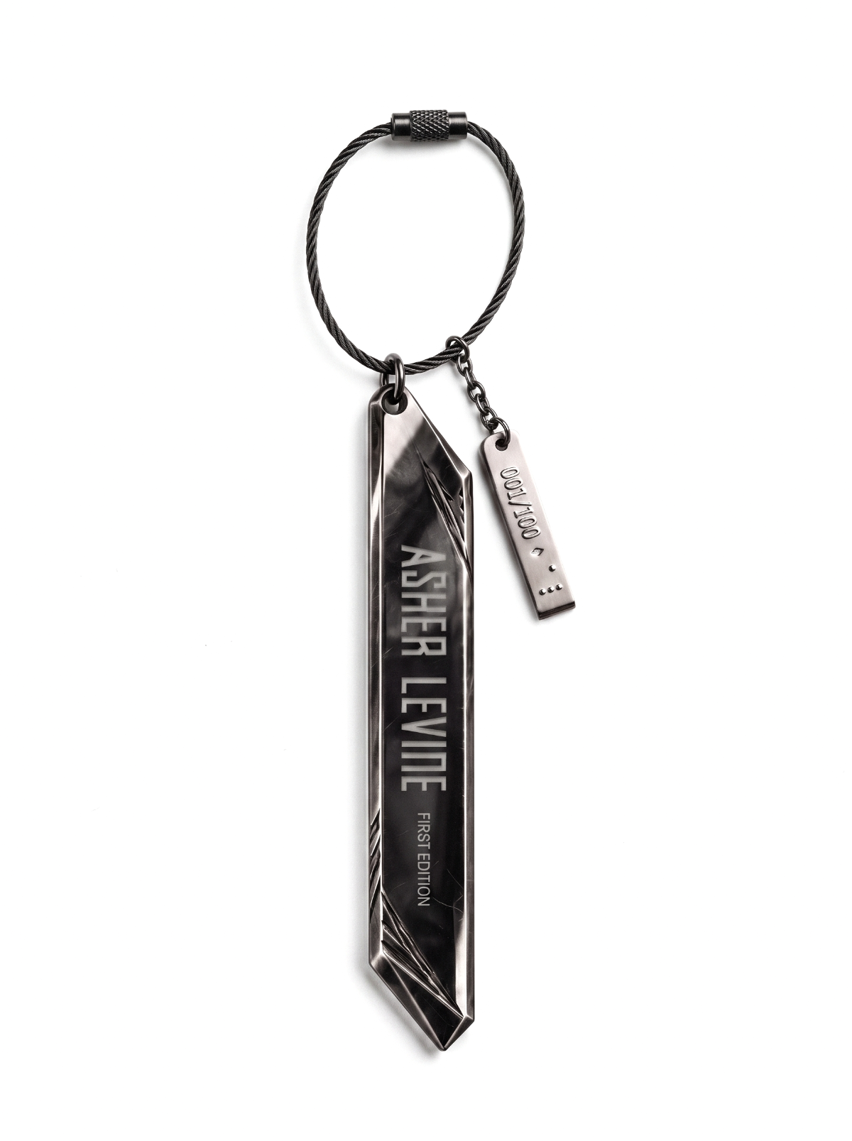
First Edition ALien Shard

First Edition ALien Shard

A First Edition ALien Shard accompanied by a numbered AL metal plate charm.

.al-product-story-section { --al-line: rgba(var(--color-foreground), 0.2); position: relative; isolation: isolate; overflow: hidden; background: rgb(var(--color-background)); color: rgb(var(--color-foreground)); } .al-product-story-section * { box-sizing: border-box; } .al-richtext > * { margin-top: 0; } .al-richtext > *:last-child { margin-bottom: 0; } .al-story-page { max-width: 1440px; margin: 0 auto; padding-inline: 40px; } .al-section-content { position: relative; z-index: 1; } .al-section-background { position: absolute; z-index: 0; inset: 0; pointer-events: none; overflow: hidden; background: var(--al-bg-color); } .al-section-background img, .al-section-background video { width: 100%; height: 100%; display: block; object-fit: var(--al-bg-fit); object-position: var(--al-bg-position); } .al-section-background::after { content: ""; position: absolute; inset: 0; background: var(--al-overlay-color); opacity: var(--al-overlay-opacity); } .al-eyebrow { margin: 0; text-transform: uppercase; letter-spacing: .17em; font-size: 9px; } .al-eyebrow > *,.al-story-label > *,.al-story-value > *,.al-media-caption > * { margin: 0; } .al-story-heading { font-family: var(--font-heading-family); font-style: var(--font-heading-style); font-weight: var(--font-heading-weight); font-size: clamp(42px, 5vw, 72px); line-height: .95; letter-spacing: -.04em; margin: 18px 0 28px; color: inherit; } .al-story-heading > * { margin: 0; font: inherit; letter-spacing: inherit; line-height: inherit; } .al-story-rte { max-width: 560px; color: rgba(var(--color-foreground), .74); font-size: 14px; line-height: 1.72; } .al-story-rte p { margin: 0; } .al-story-label { display: block; text-transform: uppercase; letter-spacing: .13em; font-size: 9px; margin-bottom: 8px; } .al-scroll-segment { height: 430vh; overflow: visible; } .al-scroll-sticky { position: sticky; z-index: 1; top: 0; height: 100vh; height: 100svh; overflow: hidden; background: rgb(var(--color-background)); } .al-scroll-segment.al-has-custom-bg .al-scroll-sticky { background: transparent; } .al-scroll-stage { position: absolute; inset: 0; opacity: 0; transform: scale(1.02); will-change: opacity, transform; } .al-scroll-pair { display: grid; grid-template-columns: 1fr 1fr; width: 100%; height: 100%; } .al-scroll-video,.al-scroll-fallback { width: 100%; height: 100%; display: block; object-fit: cover; } .al-scroll-shade { position: absolute; inset: 0; background: linear-gradient(180deg, rgba(0,0,0,.2), rgba(0,0,0,.04) 35%, rgba(0,0,0,.1) 68%, rgba(0,0,0,.5)); pointer-events: none; } .al-scroll-copy { position: absolute; z-index: 2; inset: 0; display: grid; place-items: center; text-align: center; padding: 32px; } .al-scroll-heading { font-family: var(--font-heading-family); font-size: clamp(46px,6vw,90px); line-height: .92; letter-spacing: -.045em; margin: 0 0 22px; color: inherit; text-shadow: 0 2px 26px rgba(0,0,0,.5); } .al-scroll-heading > *,.al-scroll-kicker > *,.al-scroll-subline > *,.al-scroll-hint > * { margin: 0; font: inherit; letter-spacing: inherit; line-height: inherit; } .al-scroll-kicker,.al-scroll-subline,.al-scroll-hint { text-transform: uppercase; letter-spacing: .17em; font-size: 9px; } .al-scroll-kicker { margin: 0 0 20px; }.al-scroll-subline { margin: 0; } .al-scroll-hint { position: absolute; z-index: 3; bottom: 26px; left: 50%; transform: translateX(-50%); opacity: .72; white-space: nowrap; } .al-editorial-section { padding: 96px 0; } .al-editorial-grid { display: grid; grid-template-columns: .75fr 1.25fr; gap: 70px; align-items: center; } .al-editorial-media { height: min(72vw,820px); position: relative; background: rgba(var(--color-foreground),.05); overflow: hidden; } .al-editorial-media img { width: 100%; height: 100%; object-fit: contain; padding: 5%; } .al-media-caption { position: absolute; right: 22px; bottom: 22px; background: rgba(var(--color-background),.88); padding: 12px 14px; text-transform: uppercase; letter-spacing: .13em; font-size: 8px; } .al-fact-grid { display: grid; grid-template-columns: repeat(3,1fr); border-top: 1px solid var(--al-line); margin-top: 42px; } .al-fact-grid > div { padding: 18px 14px 0 0; border-right: 1px solid var(--al-line); } .al-fact-grid > div + div { padding-left: 14px; }.al-fact-grid > div:last-child { border-right: 0; } .al-fact-grid .al-story-value { font-size: 11px; color: rgba(var(--color-foreground),.72); } .al-feature-grid { min-height: 880px; display: grid; grid-template-columns: .82fr 1.18fr; } .al-feature-copy { padding: 105px 62px 105px max(40px,calc((100vw - 1440px)/2 + 40px)); display: flex; flex-direction: column; justify-content: center; } .al-feature-media { position: relative; overflow: hidden; background: #111; } .al-feature-media > img,.al-feature-media > video { width: 100%; height: 100%; display: block; object-fit: cover; filter: brightness(.72) contrast(1.08); } .al-feature-media::after { content: ""; position: absolute; inset: 0; background: linear-gradient(90deg, rgba(var(--color-background),1), transparent 40%); } .al-feature-details { display: flex; gap: 34px; flex-wrap: wrap; border-top: 1px solid var(--al-line); padding-top: 20px; margin-top: 34px; } .al-feature-details .al-story-value { font-size: 11px; color: rgba(var(--color-foreground),.68); } .al-feature-badge { position: absolute; z-index: 2; width: min(var(--al-badge-width,200px),42vw); transform: rotate(var(--al-badge-rotation,0deg)); } .al-feature-badge--bottom-right { right: 7%; bottom: 8%; }.al-feature-badge--bottom-left { left: 7%; bottom: 8%; }.al-feature-badge--top-right { right: 7%; top: 8%; }.al-feature-badge--top-left { left: 7%; top: 8%; } .al-feature-badge--text { aspect-ratio: 1; border: 1px solid rgba(var(--color-foreground),.42); border-radius: 50%; display: grid; place-items: center; padding: 14px; text-align: center; text-transform: uppercase; letter-spacing: .14em; font-size: 8px; } .al-feature-badge--image { isolation: isolate; } .al-feature-badge--image img { display: block; width: 100%; height: auto; object-fit: contain; } .al-feature-badge-label { position: absolute; z-index: 1; top: 50%; left: 50%; width: 72%; transform: translate(-50%,calc(-50% + var(--al-badge-text-offset,0px))); color: var(--al-badge-text-color,#fff); font-size: var(--al-badge-text-size,11px); line-height: 1.15; text-align: center; text-transform: uppercase; letter-spacing: .14em; } .al-craft-grid { display: grid; grid-template-columns: 1fr 1fr; min-height: 820px; } .al-craft-image { overflow: hidden; background: #111; }.al-craft-image img { width: 100%; height: 100%; object-fit: cover; transform: scale(1.35); filter: grayscale(1) contrast(1.15) brightness(.62); } .al-craft-copy { padding: 96px max(40px,calc((100vw - 1440px)/2 + 40px)) 96px 76px; display: flex; flex-direction: column; justify-content: center; } .al-detail-list { list-style: none; padding: 0; margin: 36px 0 0; border-top: 1px solid var(--al-line); } .al-detail-list li { display: grid; grid-template-columns: 135px 1fr; gap: 24px; padding: 15px 0; border-bottom: 1px solid var(--al-line); } .al-detail-list li .al-story-value { font-size: 12px; color: rgba(var(--color-foreground),.72); } .al-details-section,.al-release-section { padding: 100px 0; } .al-section-head { display: grid; grid-template-columns: .82fr 1.18fr; gap: 70px; align-items: end; } .al-spec-grid { display: grid; grid-template-columns: repeat(6,1fr); border-block: 1px solid var(--al-line); margin-top: 56px; } .al-spec-grid > div { padding: 22px 18px; border-right: 1px solid var(--al-line); min-height: 104px; }.al-spec-grid > div:last-child { border-right: 0; }.al-spec-grid .al-story-value { font-size: 12px; } .al-release-grid { display: grid; grid-template-columns: repeat(3,1fr); margin-top: 58px; border-top: 1px solid var(--al-line); } .al-release-grid article { padding: 28px 28px 30px 0; border-bottom: 1px solid var(--al-line); }.al-release-grid article + article { padding-left: 28px; border-left: 1px solid var(--al-line); } .al-release-title { font-family: var(--font-heading-family); font-size: 25px; line-height: 1.08; margin: 0 0 16px; color: inherit; }.al-release-title > * { margin: 0; font: inherit; line-height: inherit; }.al-release-copy { font-size: 12px; color: rgba(var(--color-foreground),.72); } .al-delivery-grid { display: grid; grid-template-columns: repeat(3,1fr); margin-top: 36px; border: 1px solid var(--al-line); background: rgba(var(--color-foreground),.04); } .al-delivery-grid > div { padding: 20px 22px; border-right: 1px solid var(--al-line); }.al-delivery-grid > div:last-child { border-right: 0; }.al-delivery-grid .al-story-value { font-size: 11px; color: rgba(var(--color-foreground),.72); } .al-inquiry-section { min-height: 92vh; display: grid; grid-template-columns: minmax(0,.9fr) minmax(0,1.1fr); background: var(--inq-bg); color: var(--inq-text); } .al-inquiry-copy { padding: clamp(70px,8vw,140px) clamp(28px,6vw,100px); display: flex; flex-direction: column; justify-content: center; } .al-inquiry-heading { font-family: var(--font-heading-family); font-size: clamp(48px,6.2vw,96px); line-height: .88; letter-spacing: -.055em; margin: 18px 0 30px; max-width: 760px; color: var(--inq-text); }.al-inquiry-heading > * { margin: 0; font: inherit; letter-spacing: inherit; line-height: inherit; } .al-inquiry-body { color: var(--inq-muted); font-size: 14px; line-height: 1.65; max-width: 560px; }.al-inquiry-form { margin-top: 42px; max-width: 680px; }.al-inquiry-fields { display: grid; grid-template-columns: 1fr 1fr; gap: 18px; } .al-inquiry-form label { display: block; margin-bottom: 18px; }.al-inquiry-form label span { display: block; text-transform: uppercase; letter-spacing: .14em; font-size: 8px; margin-bottom: 8px; } .al-inquiry-form input,.al-inquiry-form textarea { width: 100%; border: 0; border-bottom: 1px solid color-mix(in srgb,var(--inq-text) 35%,transparent); background: transparent; color: var(--inq-text); padding: 10px 0; border-radius: 0; font: inherit; } .al-inquiry-form input:focus,.al-inquiry-form textarea:focus { outline: 0; border-color: var(--inq-accent); } .al-inquiry-form button { width: 100%; margin-top: 8px; background: var(--inq-accent); color: var(--inq-bg); border: 1px solid var(--inq-accent); padding: 20px 22px; display: flex; justify-content: space-between; text-transform: uppercase; letter-spacing: .14em; font-size: 10px; cursor: pointer; } .al-inquiry-product { margin: 14px 0 0; color: var(--inq-muted); text-transform: uppercase; letter-spacing: .12em; font-size: 8px; }.al-inquiry-success { border: 1px solid var(--inq-accent); padding: 15px; margin-bottom: 20px; } .al-inquiry-visuals { position: relative; min-height: 880px; background: #111; }.al-inquiry-image { position: absolute; overflow: hidden; }.al-inquiry-image img { width: 100%; height: 100%; object-fit: cover; filter: grayscale(1) contrast(1.08); } .al-inquiry-image--studio { inset: 0 0 0 12%; clip-path: polygon(12% 0,100% 0,100% 100%,0 100%); }.al-inquiry-image--portrait { z-index: 2; left: 0; bottom: 7%; width: 42%; height: 55%; border: 1px solid color-mix(in srgb,var(--inq-text) 35%,transparent); transform: translateX(-9%) rotate(-2deg); } @media (max-width: 990px) { .al-story-page { padding-inline: 22px; } .al-editorial-grid,.al-feature-grid,.al-craft-grid,.al-section-head,.al-inquiry-section { grid-template-columns: 1fr; } .al-editorial-grid { gap: 42px; }.al-feature-copy,.al-craft-copy { padding: 78px 24px; }.al-feature-media,.al-craft-image { min-height: 620px; } .al-spec-grid { grid-template-columns: repeat(3,1fr); }.al-release-grid { grid-template-columns: 1fr; }.al-release-grid article + article { padding-left: 0; border-left: 0; } .al-scroll-pair { grid-template-columns: 1fr; }.al-scroll-video--echo { display: none; } .al-inquiry-visuals { min-height: 700px; order: -1; }.al-inquiry-copy { padding: 72px 24px; } } @media (max-width: 620px) { .al-scroll-segment { height: 390vh; }.al-editorial-section,.al-details-section,.al-release-section { padding: 74px 0; }.al-editorial-media { height: 520px; }.al-feature-media,.al-craft-image { min-height: 500px; } .al-fact-grid,.al-delivery-grid { grid-template-columns: 1fr; }.al-fact-grid > div,.al-fact-grid > div + div,.al-delivery-grid > div { padding: 16px 0; border-right: 0; border-bottom: 1px solid var(--al-line); } .al-spec-grid { grid-template-columns: 1fr 1fr; }.al-spec-grid > div:nth-child(even) { border-right: 0; }.al-release-title { font-size: 22px; } .al-inquiry-visuals { min-height: 520px; }.al-inquiry-fields { grid-template-columns: 1fr; }.al-inquiry-image--portrait { width: 48%; height: 50%; } } @media (max-width: 749px) { .al-feature-badge { width: min(calc(var(--al-badge-width,200px) * .7),42vw); } }

02 / The silhouette

Own every room you enter.

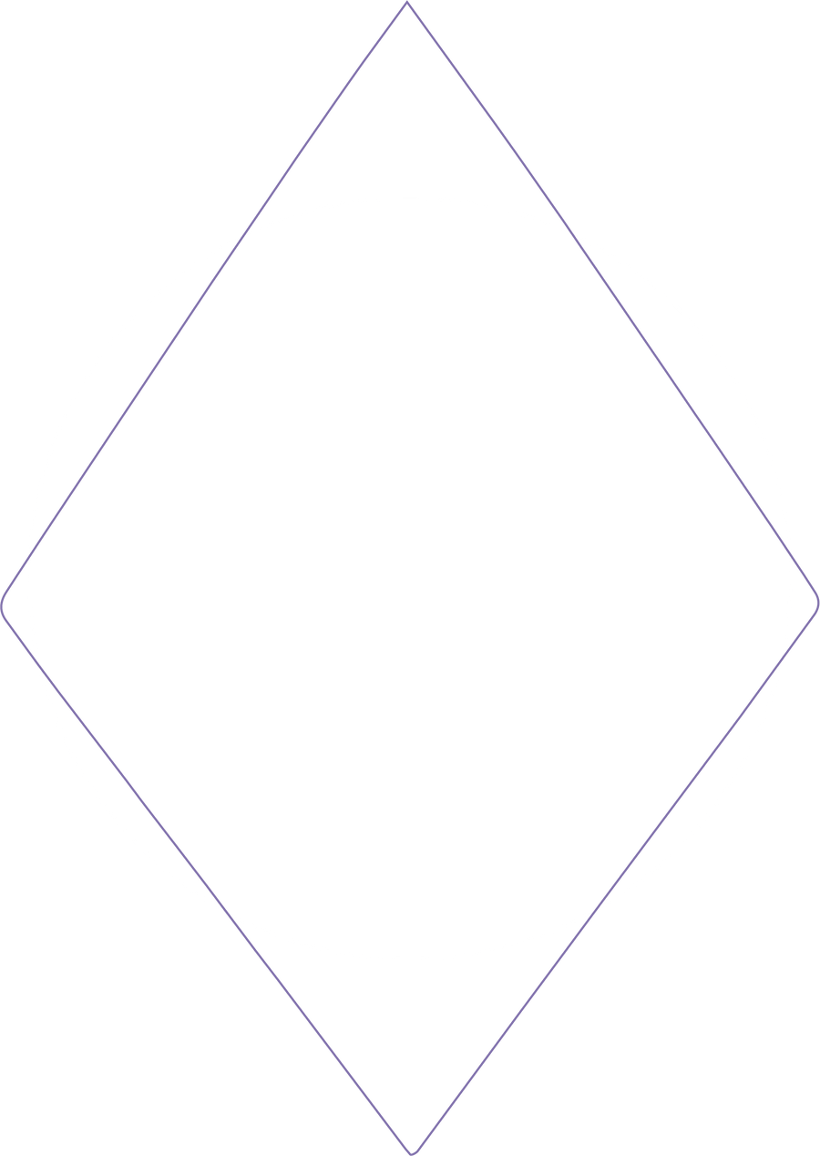
Faceted geometry gives you a silhouette people notice before you say a word. Its sculptural form is beautiful from every angle, with a distinct profile each way you turn it.

Sculptural diamond geometry

Full-grain Italian leather

Made in Los Angeles

.al-product-story-section { --al-line: rgba(var(--color-foreground), 0.2); position: relative; isolation: isolate; overflow: hidden; background: rgb(var(--color-background)); color: rgb(var(--color-foreground)); } .al-product-story-section * { box-sizing: border-box; } .al-richtext > * { margin-top: 0; } .al-richtext > *:last-child { margin-bottom: 0; } .al-story-page { max-width: 1440px; margin: 0 auto; padding-inline: 40px; } .al-section-content { position: relative; z-index: 1; } .al-section-background { position: absolute; z-index: 0; inset: 0; pointer-events: none; overflow: hidden; background: var(--al-bg-color); } .al-section-background img, .al-section-background video { width: 100%; height: 100%; display: block; object-fit: var(--al-bg-fit); object-position: var(--al-bg-position); } .al-section-background::after { content: ""; position: absolute; inset: 0; background: var(--al-overlay-color); opacity: var(--al-overlay-opacity); } .al-eyebrow { margin: 0; text-transform: uppercase; letter-spacing: .17em; font-size: 9px; } .al-eyebrow > *,.al-story-label > *,.al-story-value > *,.al-media-caption > * { margin: 0; } .al-story-heading { font-family: var(--font-heading-family); font-style: var(--font-heading-style); font-weight: var(--font-heading-weight); font-size: clamp(42px, 5vw, 72px); line-height: .95; letter-spacing: -.04em; margin: 18px 0 28px; color: inherit; } .al-story-heading > * { margin: 0; font: inherit; letter-spacing: inherit; line-height: inherit; } .al-story-rte { max-width: 560px; color: rgba(var(--color-foreground), .74); font-size: 14px; line-height: 1.72; } .al-story-rte p { margin: 0; } .al-story-label { display: block; text-transform: uppercase; letter-spacing: .13em; font-size: 9px; margin-bottom: 8px; } .al-scroll-segment { height: 430vh; overflow: visible; } .al-scroll-sticky { position: sticky; z-index: 1; top: 0; height: 100vh; height: 100svh; overflow: hidden; background: rgb(var(--color-background)); } .al-scroll-segment.al-has-custom-bg .al-scroll-sticky { background: transparent; } .al-scroll-stage { position: absolute; inset: 0; opacity: 0; transform: scale(1.02); will-change: opacity, transform; } .al-scroll-pair { display: grid; grid-template-columns: 1fr 1fr; width: 100%; height: 100%; } .al-scroll-video,.al-scroll-fallback { width: 100%; height: 100%; display: block; object-fit: cover; } .al-scroll-shade { position: absolute; inset: 0; background: linear-gradient(180deg, rgba(0,0,0,.2), rgba(0,0,0,.04) 35%, rgba(0,0,0,.1) 68%, rgba(0,0,0,.5)); pointer-events: none; } .al-scroll-copy { position: absolute; z-index: 2; inset: 0; display: grid; place-items: center; text-align: center; padding: 32px; } .al-scroll-heading { font-family: var(--font-heading-family); font-size: clamp(46px,6vw,90px); line-height: .92; letter-spacing: -.045em; margin: 0 0 22px; color: inherit; text-shadow: 0 2px 26px rgba(0,0,0,.5); } .al-scroll-heading > *,.al-scroll-kicker > *,.al-scroll-subline > *,.al-scroll-hint > * { margin: 0; font: inherit; letter-spacing: inherit; line-height: inherit; } .al-scroll-kicker,.al-scroll-subline,.al-scroll-hint { text-transform: uppercase; letter-spacing: .17em; font-size: 9px; } .al-scroll-kicker { margin: 0 0 20px; }.al-scroll-subline { margin: 0; } .al-scroll-hint { position: absolute; z-index: 3; bottom: 26px; left: 50%; transform: translateX(-50%); opacity: .72; white-space: nowrap; } .al-editorial-section { padding: 96px 0; } .al-editorial-grid { display: grid; grid-template-columns: .75fr 1.25fr; gap: 70px; align-items: center; } .al-editorial-media { height: min(72vw,820px); position: relative; background: rgba(var(--color-foreground),.05); overflow: hidden; } .al-editorial-media img { width: 100%; height: 100%; object-fit: contain; padding: 5%; } .al-media-caption { position: absolute; right: 22px; bottom: 22px; background: rgba(var(--color-background),.88); padding: 12px 14px; text-transform: uppercase; letter-spacing: .13em; font-size: 8px; } .al-fact-grid { display: grid; grid-template-columns: repeat(3,1fr); border-top: 1px solid var(--al-line); margin-top: 42px; } .al-fact-grid > div { padding: 18px 14px 0 0; border-right: 1px solid var(--al-line); } .al-fact-grid > div + div { padding-left: 14px; }.al-fact-grid > div:last-child { border-right: 0; } .al-fact-grid .al-story-value { font-size: 11px; color: rgba(var(--color-foreground),.72); } .al-feature-grid { min-height: 880px; display: grid; grid-template-columns: .82fr 1.18fr; } .al-feature-copy { padding: 105px 62px 105px max(40px,calc((100vw - 1440px)/2 + 40px)); display: flex; flex-direction: column; justify-content: center; } .al-feature-media { position: relative; overflow: hidden; background: #111; } .al-feature-media > img,.al-feature-media > video { width: 100%; height: 100%; display: block; object-fit: cover; filter: brightness(.72) contrast(1.08); } .al-feature-media::after { content: ""; position: absolute; inset: 0; background: linear-gradient(90deg, rgba(var(--color-background),1), transparent 40%); } .al-feature-details { display: flex; gap: 34px; flex-wrap: wrap; border-top: 1px solid var(--al-line); padding-top: 20px; margin-top: 34px; } .al-feature-details .al-story-value { font-size: 11px; color: rgba(var(--color-foreground),.68); } .al-feature-badge { position: absolute; z-index: 2; width: min(var(--al-badge-width,200px),42vw); transform: rotate(var(--al-badge-rotation,0deg)); } .al-feature-badge--bottom-right { right: 7%; bottom: 8%; }.al-feature-badge--bottom-left { left: 7%; bottom: 8%; }.al-feature-badge--top-right { right: 7%; top: 8%; }.al-feature-badge--top-left { left: 7%; top: 8%; } .al-feature-badge--text { aspect-ratio: 1; border: 1px solid rgba(var(--color-foreground),.42); border-radius: 50%; display: grid; place-items: center; padding: 14px; text-align: center; text-transform: uppercase; letter-spacing: .14em; font-size: 8px; } .al-feature-badge--image { isolation: isolate; } .al-feature-badge--image img { display: block; width: 100%; height: auto; object-fit: contain; } .al-feature-badge-label { position: absolute; z-index: 1; top: 50%; left: 50%; width: 72%; transform: translate(-50%,calc(-50% + var(--al-badge-text-offset,0px))); color: var(--al-badge-text-color,#fff); font-size: var(--al-badge-text-size,11px); line-height: 1.15; text-align: center; text-transform: uppercase; letter-spacing: .14em; } .al-craft-grid { display: grid; grid-template-columns: 1fr 1fr; min-height: 820px; } .al-craft-image { overflow: hidden; background: #111; }.al-craft-image img { width: 100%; height: 100%; object-fit: cover; transform: scale(1.35); filter: grayscale(1) contrast(1.15) brightness(.62); } .al-craft-copy { padding: 96px max(40px,calc((100vw - 1440px)/2 + 40px)) 96px 76px; display: flex; flex-direction: column; justify-content: center; } .al-detail-list { list-style: none; padding: 0; margin: 36px 0 0; border-top: 1px solid var(--al-line); } .al-detail-list li { display: grid; grid-template-columns: 135px 1fr; gap: 24px; padding: 15px 0; border-bottom: 1px solid var(--al-line); } .al-detail-list li .al-story-value { font-size: 12px; color: rgba(var(--color-foreground),.72); } .al-details-section,.al-release-section { padding: 100px 0; } .al-section-head { display: grid; grid-template-columns: .82fr 1.18fr; gap: 70px; align-items: end; } .al-spec-grid { display: grid; grid-template-columns: repeat(6,1fr); border-block: 1px solid var(--al-line); margin-top: 56px; } .al-spec-grid > div { padding: 22px 18px; border-right: 1px solid var(--al-line); min-height: 104px; }.al-spec-grid > div:last-child { border-right: 0; }.al-spec-grid .al-story-value { font-size: 12px; } .al-release-grid { display: grid; grid-template-columns: repeat(3,1fr); margin-top: 58px; border-top: 1px solid var(--al-line); } .al-release-grid article { padding: 28px 28px 30px 0; border-bottom: 1px solid var(--al-line); }.al-release-grid article + article { padding-left: 28px; border-left: 1px solid var(--al-line); } .al-release-title { font-family: var(--font-heading-family); font-size: 25px; line-height: 1.08; margin: 0 0 16px; color: inherit; }.al-release-title > * { margin: 0; font: inherit; line-height: inherit; }.al-release-copy { font-size: 12px; color: rgba(var(--color-foreground),.72); } .al-delivery-grid { display: grid; grid-template-columns: repeat(3,1fr); margin-top: 36px; border: 1px solid var(--al-line); background: rgba(var(--color-foreground),.04); } .al-delivery-grid > div { padding: 20px 22px; border-right: 1px solid var(--al-line); }.al-delivery-grid > div:last-child { border-right: 0; }.al-delivery-grid .al-story-value { font-size: 11px; color: rgba(var(--color-foreground),.72); } .al-inquiry-section { min-height: 92vh; display: grid; grid-template-columns: minmax(0,.9fr) minmax(0,1.1fr); background: var(--inq-bg); color: var(--inq-text); } .al-inquiry-copy { padding: clamp(70px,8vw,140px) clamp(28px,6vw,100px); display: flex; flex-direction: column; justify-content: center; } .al-inquiry-heading { font-family: var(--font-heading-family); font-size: clamp(48px,6.2vw,96px); line-height: .88; letter-spacing: -.055em; margin: 18px 0 30px; max-width: 760px; color: var(--inq-text); }.al-inquiry-heading > * { margin: 0; font: inherit; letter-spacing: inherit; line-height: inherit; } .al-inquiry-body { color: var(--inq-muted); font-size: 14px; line-height: 1.65; max-width: 560px; }.al-inquiry-form { margin-top: 42px; max-width: 680px; }.al-inquiry-fields { display: grid; grid-template-columns: 1fr 1fr; gap: 18px; } .al-inquiry-form label { display: block; margin-bottom: 18px; }.al-inquiry-form label span { display: block; text-transform: uppercase; letter-spacing: .14em; font-size: 8px; margin-bottom: 8px; } .al-inquiry-form input,.al-inquiry-form textarea { width: 100%; border: 0; border-bottom: 1px solid color-mix(in srgb,var(--inq-text) 35%,transparent); background: transparent; color: var(--inq-text); padding: 10px 0; border-radius: 0; font: inherit; } .al-inquiry-form input:focus,.al-inquiry-form textarea:focus { outline: 0; border-color: var(--inq-accent); } .al-inquiry-form button { width: 100%; margin-top: 8px; background: var(--inq-accent); color: var(--inq-bg); border: 1px solid var(--inq-accent); padding: 20px 22px; display: flex; justify-content: space-between; text-transform: uppercase; letter-spacing: .14em; font-size: 10px; cursor: pointer; } .al-inquiry-product { margin: 14px 0 0; color: var(--inq-muted); text-transform: uppercase; letter-spacing: .12em; font-size: 8px; }.al-inquiry-success { border: 1px solid var(--inq-accent); padding: 15px; margin-bottom: 20px; } .al-inquiry-visuals { position: relative; min-height: 880px; background: #111; }.al-inquiry-image { position: absolute; overflow: hidden; }.al-inquiry-image img { width: 100%; height: 100%; object-fit: cover; filter: grayscale(1) contrast(1.08); } .al-inquiry-image--studio { inset: 0 0 0 12%; clip-path: polygon(12% 0,100% 0,100% 100%,0 100%); }.al-inquiry-image--portrait { z-index: 2; left: 0; bottom: 7%; width: 42%; height: 55%; border: 1px solid color-mix(in srgb,var(--inq-text) 35%,transparent); transform: translateX(-9%) rotate(-2deg); } @media (max-width: 990px) { .al-story-page { padding-inline: 22px; } .al-editorial-grid,.al-feature-grid,.al-craft-grid,.al-section-head,.al-inquiry-section { grid-template-columns: 1fr; } .al-editorial-grid { gap: 42px; }.al-feature-copy,.al-craft-copy { padding: 78px 24px; }.al-feature-media,.al-craft-image { min-height: 620px; } .al-spec-grid { grid-template-columns: repeat(3,1fr); }.al-release-grid { grid-template-columns: 1fr; }.al-release-grid article + article { padding-left: 0; border-left: 0; } .al-scroll-pair { grid-template-columns: 1fr; }.al-scroll-video--echo { display: none; } .al-inquiry-visuals { min-height: 700px; order: -1; }.al-inquiry-copy { padding: 72px 24px; } } @media (max-width: 620px) { .al-scroll-segment { height: 390vh; }.al-editorial-section,.al-details-section,.al-release-section { padding: 74px 0; }.al-editorial-media { height: 520px; }.al-feature-media,.al-craft-image { min-height: 500px; } .al-fact-grid,.al-delivery-grid { grid-template-columns: 1fr; }.al-fact-grid > div,.al-fact-grid > div + div,.al-delivery-grid > div { padding: 16px 0; border-right: 0; border-bottom: 1px solid var(--al-line); } .al-spec-grid { grid-template-columns: 1fr 1fr; }.al-spec-grid > div:nth-child(even) { border-right: 0; }.al-release-title { font-size: 22px; } .al-inquiry-visuals { min-height: 520px; }.al-inquiry-fields { grid-template-columns: 1fr; }.al-inquiry-image--portrait { width: 48%; height: 50%; } } @media (max-width: 749px) { .al-feature-badge { width: min(calc(var(--al-badge-width,200px) * .7),42vw); } }

03 / Integrated illumination

Glow wherever you go.

Light your diamond in any color, motion, and intensity you choose, so your atmosphere evolves with your look, your mood, your moment.

Programmable

Animated patterns

Day to night

Product feature badgeIntegrated illumination
.al-product-story-section { --al-line: rgba(var(--color-foreground), 0.2); position: relative; isolation: isolate; overflow: hidden; background: rgb(var(--color-background)); color: rgb(var(--color-foreground)); } .al-product-story-section * { box-sizing: border-box; } .al-richtext > * { margin-top: 0; } .al-richtext > *:last-child { margin-bottom: 0; } .al-story-page { max-width: 1440px; margin: 0 auto; padding-inline: 40px; } .al-section-content { position: relative; z-index: 1; } .al-section-background { position: absolute; z-index: 0; inset: 0; pointer-events: none; overflow: hidden; background: var(--al-bg-color); } .al-section-background img, .al-section-background video { width: 100%; height: 100%; display: block; object-fit: var(--al-bg-fit); object-position: var(--al-bg-position); } .al-section-background::after { content: ""; position: absolute; inset: 0; background: var(--al-overlay-color); opacity: var(--al-overlay-opacity); } .al-eyebrow { margin: 0; text-transform: uppercase; letter-spacing: .17em; font-size: 9px; } .al-eyebrow > *,.al-story-label > *,.al-story-value > *,.al-media-caption > * { margin: 0; } .al-story-heading { font-family: var(--font-heading-family); font-style: var(--font-heading-style); font-weight: var(--font-heading-weight); font-size: clamp(42px, 5vw, 72px); line-height: .95; letter-spacing: -.04em; margin: 18px 0 28px; color: inherit; } .al-story-heading > * { margin: 0; font: inherit; letter-spacing: inherit; line-height: inherit; } .al-story-rte { max-width: 560px; color: rgba(var(--color-foreground), .74); font-size: 14px; line-height: 1.72; } .al-story-rte p { margin: 0; } .al-story-label { display: block; text-transform: uppercase; letter-spacing: .13em; font-size: 9px; margin-bottom: 8px; } .al-scroll-segment { height: 430vh; overflow: visible; } .al-scroll-sticky { position: sticky; z-index: 1; top: 0; height: 100vh; height: 100svh; overflow: hidden; background: rgb(var(--color-background)); } .al-scroll-segment.al-has-custom-bg .al-scroll-sticky { background: transparent; } .al-scroll-stage { position: absolute; inset: 0; opacity: 0; transform: scale(1.02); will-change: opacity, transform; } .al-scroll-pair { display: grid; grid-template-columns: 1fr 1fr; width: 100%; height: 100%; } .al-scroll-video,.al-scroll-fallback { width: 100%; height: 100%; display: block; object-fit: cover; } .al-scroll-shade { position: absolute; inset: 0; background: linear-gradient(180deg, rgba(0,0,0,.2), rgba(0,0,0,.04) 35%, rgba(0,0,0,.1) 68%, rgba(0,0,0,.5)); pointer-events: none; } .al-scroll-copy { position: absolute; z-index: 2; inset: 0; display: grid; place-items: center; text-align: center; padding: 32px; } .al-scroll-heading { font-family: var(--font-heading-family); font-size: clamp(46px,6vw,90px); line-height: .92; letter-spacing: -.045em; margin: 0 0 22px; color: inherit; text-shadow: 0 2px 26px rgba(0,0,0,.5); } .al-scroll-heading > *,.al-scroll-kicker > *,.al-scroll-subline > *,.al-scroll-hint > * { margin: 0; font: inherit; letter-spacing: inherit; line-height: inherit; } .al-scroll-kicker,.al-scroll-subline,.al-scroll-hint { text-transform: uppercase; letter-spacing: .17em; font-size: 9px; } .al-scroll-kicker { margin: 0 0 20px; }.al-scroll-subline { margin: 0; } .al-scroll-hint { position: absolute; z-index: 3; bottom: 26px; left: 50%; transform: translateX(-50%); opacity: .72; white-space: nowrap; } .al-editorial-section { padding: 96px 0; } .al-editorial-grid { display: grid; grid-template-columns: .75fr 1.25fr; gap: 70px; align-items: center; } .al-editorial-media { height: min(72vw,820px); position: relative; background: rgba(var(--color-foreground),.05); overflow: hidden; } .al-editorial-media img { width: 100%; height: 100%; object-fit: contain; padding: 5%; } .al-media-caption { position: absolute; right: 22px; bottom: 22px; background: rgba(var(--color-background),.88); padding: 12px 14px; text-transform: uppercase; letter-spacing: .13em; font-size: 8px; } .al-fact-grid { display: grid; grid-template-columns: repeat(3,1fr); border-top: 1px solid var(--al-line); margin-top: 42px; } .al-fact-grid > div { padding: 18px 14px 0 0; border-right: 1px solid var(--al-line); } .al-fact-grid > div + div { padding-left: 14px; }.al-fact-grid > div:last-child { border-right: 0; } .al-fact-grid .al-story-value { font-size: 11px; color: rgba(var(--color-foreground),.72); } .al-feature-grid { min-height: 880px; display: grid; grid-template-columns: .82fr 1.18fr; } .al-feature-copy { padding: 105px 62px 105px max(40px,calc((100vw - 1440px)/2 + 40px)); display: flex; flex-direction: column; justify-content: center; } .al-feature-media { position: relative; overflow: hidden; background: #111; } .al-feature-media > img,.al-feature-media > video { width: 100%; height: 100%; display: block; object-fit: cover; filter: brightness(.72) contrast(1.08); } .al-feature-media::after { content: ""; position: absolute; inset: 0; background: linear-gradient(90deg, rgba(var(--color-background),1), transparent 40%); } .al-feature-details { display: flex; gap: 34px; flex-wrap: wrap; border-top: 1px solid var(--al-line); padding-top: 20px; margin-top: 34px; } .al-feature-details .al-story-value { font-size: 11px; color: rgba(var(--color-foreground),.68); } .al-feature-badge { position: absolute; z-index: 2; width: min(var(--al-badge-width,200px),42vw); transform: rotate(var(--al-badge-rotation,0deg)); } .al-feature-badge--bottom-right { right: 7%; bottom: 8%; }.al-feature-badge--bottom-left { left: 7%; bottom: 8%; }.al-feature-badge--top-right { right: 7%; top: 8%; }.al-feature-badge--top-left { left: 7%; top: 8%; } .al-feature-badge--text { aspect-ratio: 1; border: 1px solid rgba(var(--color-foreground),.42); border-radius: 50%; display: grid; place-items: center; padding: 14px; text-align: center; text-transform: uppercase; letter-spacing: .14em; font-size: 8px; } .al-feature-badge--image { isolation: isolate; } .al-feature-badge--image img { display: block; width: 100%; height: auto; object-fit: contain; } .al-feature-badge-label { position: absolute; z-index: 1; top: 50%; left: 50%; width: 72%; transform: translate(-50%,calc(-50% + var(--al-badge-text-offset,0px))); color: var(--al-badge-text-color,#fff); font-size: var(--al-badge-text-size,11px); line-height: 1.15; text-align: center; text-transform: uppercase; letter-spacing: .14em; } .al-craft-grid { display: grid; grid-template-columns: 1fr 1fr; min-height: 820px; } .al-craft-image { overflow: hidden; background: #111; }.al-craft-image img { width: 100%; height: 100%; object-fit: cover; transform: scale(1.35); filter: grayscale(1) contrast(1.15) brightness(.62); } .al-craft-copy { padding: 96px max(40px,calc((100vw - 1440px)/2 + 40px)) 96px 76px; display: flex; flex-direction: column; justify-content: center; } .al-detail-list { list-style: none; padding: 0; margin: 36px 0 0; border-top: 1px solid var(--al-line); } .al-detail-list li { display: grid; grid-template-columns: 135px 1fr; gap: 24px; padding: 15px 0; border-bottom: 1px solid var(--al-line); } .al-detail-list li .al-story-value { font-size: 12px; color: rgba(var(--color-foreground),.72); } .al-details-section,.al-release-section { padding: 100px 0; } .al-section-head { display: grid; grid-template-columns: .82fr 1.18fr; gap: 70px; align-items: end; } .al-spec-grid { display: grid; grid-template-columns: repeat(6,1fr); border-block: 1px solid var(--al-line); margin-top: 56px; } .al-spec-grid > div { padding: 22px 18px; border-right: 1px solid var(--al-line); min-height: 104px; }.al-spec-grid > div:last-child { border-right: 0; }.al-spec-grid .al-story-value { font-size: 12px; } .al-release-grid { display: grid; grid-template-columns: repeat(3,1fr); margin-top: 58px; border-top: 1px solid var(--al-line); } .al-release-grid article { padding: 28px 28px 30px 0; border-bottom: 1px solid var(--al-line); }.al-release-grid article + article { padding-left: 28px; border-left: 1px solid var(--al-line); } .al-release-title { font-family: var(--font-heading-family); font-size: 25px; line-height: 1.08; margin: 0 0 16px; color: inherit; }.al-release-title > * { margin: 0; font: inherit; line-height: inherit; }.al-release-copy { font-size: 12px; color: rgba(var(--color-foreground),.72); } .al-delivery-grid { display: grid; grid-template-columns: repeat(3,1fr); margin-top: 36px; border: 1px solid var(--al-line); background: rgba(var(--color-foreground),.04); } .al-delivery-grid > div { padding: 20px 22px; border-right: 1px solid var(--al-line); }.al-delivery-grid > div:last-child { border-right: 0; }.al-delivery-grid .al-story-value { font-size: 11px; color: rgba(var(--color-foreground),.72); } .al-inquiry-section { min-height: 92vh; display: grid; grid-template-columns: minmax(0,.9fr) minmax(0,1.1fr); background: var(--inq-bg); color: var(--inq-text); } .al-inquiry-copy { padding: clamp(70px,8vw,140px) clamp(28px,6vw,100px); display: flex; flex-direction: column; justify-content: center; } .al-inquiry-heading { font-family: var(--font-heading-family); font-size: clamp(48px,6.2vw,96px); line-height: .88; letter-spacing: -.055em; margin: 18px 0 30px; max-width: 760px; color: var(--inq-text); }.al-inquiry-heading > * { margin: 0; font: inherit; letter-spacing: inherit; line-height: inherit; } .al-inquiry-body { color: var(--inq-muted); font-size: 14px; line-height: 1.65; max-width: 560px; }.al-inquiry-form { margin-top: 42px; max-width: 680px; }.al-inquiry-fields { display: grid; grid-template-columns: 1fr 1fr; gap: 18px; } .al-inquiry-form label { display: block; margin-bottom: 18px; }.al-inquiry-form label span { display: block; text-transform: uppercase; letter-spacing: .14em; font-size: 8px; margin-bottom: 8px; } .al-inquiry-form input,.al-inquiry-form textarea { width: 100%; border: 0; border-bottom: 1px solid color-mix(in srgb,var(--inq-text) 35%,transparent); background: transparent; color: var(--inq-text); padding: 10px 0; border-radius: 0; font: inherit; } .al-inquiry-form input:focus,.al-inquiry-form textarea:focus { outline: 0; border-color: var(--inq-accent); } .al-inquiry-form button { width: 100%; margin-top: 8px; background: var(--inq-accent); color: var(--inq-bg); border: 1px solid var(--inq-accent); padding: 20px 22px; display: flex; justify-content: space-between; text-transform: uppercase; letter-spacing: .14em; font-size: 10px; cursor: pointer; } .al-inquiry-product { margin: 14px 0 0; color: var(--inq-muted); text-transform: uppercase; letter-spacing: .12em; font-size: 8px; }.al-inquiry-success { border: 1px solid var(--inq-accent); padding: 15px; margin-bottom: 20px; } .al-inquiry-visuals { position: relative; min-height: 880px; background: #111; }.al-inquiry-image { position: absolute; overflow: hidden; }.al-inquiry-image img { width: 100%; height: 100%; object-fit: cover; filter: grayscale(1) contrast(1.08); } .al-inquiry-image--studio { inset: 0 0 0 12%; clip-path: polygon(12% 0,100% 0,100% 100%,0 100%); }.al-inquiry-image--portrait { z-index: 2; left: 0; bottom: 7%; width: 42%; height: 55%; border: 1px solid color-mix(in srgb,var(--inq-text) 35%,transparent); transform: translateX(-9%) rotate(-2deg); } @media (max-width: 990px) { .al-story-page { padding-inline: 22px; } .al-editorial-grid,.al-feature-grid,.al-craft-grid,.al-section-head,.al-inquiry-section { grid-template-columns: 1fr; } .al-editorial-grid { gap: 42px; }.al-feature-copy,.al-craft-copy { padding: 78px 24px; }.al-feature-media,.al-craft-image { min-height: 620px; } .al-spec-grid { grid-template-columns: repeat(3,1fr); }.al-release-grid { grid-template-columns: 1fr; }.al-release-grid article + article { padding-left: 0; border-left: 0; } .al-scroll-pair { grid-template-columns: 1fr; }.al-scroll-video--echo { display: none; } .al-inquiry-visuals { min-height: 700px; order: -1; }.al-inquiry-copy { padding: 72px 24px; } } @media (max-width: 620px) { .al-scroll-segment { height: 390vh; }.al-editorial-section,.al-details-section,.al-release-section { padding: 74px 0; }.al-editorial-media { height: 520px; }.al-feature-media,.al-craft-image { min-height: 500px; } .al-fact-grid,.al-delivery-grid { grid-template-columns: 1fr; }.al-fact-grid > div,.al-fact-grid > div + div,.al-delivery-grid > div { padding: 16px 0; border-right: 0; border-bottom: 1px solid var(--al-line); } .al-spec-grid { grid-template-columns: 1fr 1fr; }.al-spec-grid > div:nth-child(even) { border-right: 0; }.al-release-title { font-size: 22px; } .al-inquiry-visuals { min-height: 520px; }.al-inquiry-fields { grid-template-columns: 1fr; }.al-inquiry-image--portrait { width: 48%; height: 50%; } } @media (max-width: 749px) { .al-feature-badge { width: min(calc(var(--al-badge-width,200px) * .7),42vw); } }

04 / Crafted by hand

Made by hand. Made for you.

Your Diamond Bag is cut from full-grain Italian leather and finished by hand in Los Angeles. Clean edges, precise seams, and a structured interior, made to a standard you can see and feel.

  • Full-grain Italian hide

  • Top handles + removable strap

  • Zip pocket and structured capacity

  • 24 × 14 × 5 inches

.al-product-story-section { --al-line: rgba(var(--color-foreground), 0.2); position: relative; isolation: isolate; overflow: hidden; background: rgb(var(--color-background)); color: rgb(var(--color-foreground)); } .al-product-story-section * { box-sizing: border-box; } .al-richtext > * { margin-top: 0; } .al-richtext > *:last-child { margin-bottom: 0; } .al-story-page { max-width: 1440px; margin: 0 auto; padding-inline: 40px; } .al-section-content { position: relative; z-index: 1; } .al-section-background { position: absolute; z-index: 0; inset: 0; pointer-events: none; overflow: hidden; background: var(--al-bg-color); } .al-section-background img, .al-section-background video { width: 100%; height: 100%; display: block; object-fit: var(--al-bg-fit); object-position: var(--al-bg-position); } .al-section-background::after { content: ""; position: absolute; inset: 0; background: var(--al-overlay-color); opacity: var(--al-overlay-opacity); } .al-eyebrow { margin: 0; text-transform: uppercase; letter-spacing: .17em; font-size: 9px; } .al-eyebrow > *,.al-story-label > *,.al-story-value > *,.al-media-caption > * { margin: 0; } .al-story-heading { font-family: var(--font-heading-family); font-style: var(--font-heading-style); font-weight: var(--font-heading-weight); font-size: clamp(42px, 5vw, 72px); line-height: .95; letter-spacing: -.04em; margin: 18px 0 28px; color: inherit; } .al-story-heading > * { margin: 0; font: inherit; letter-spacing: inherit; line-height: inherit; } .al-story-rte { max-width: 560px; color: rgba(var(--color-foreground), .74); font-size: 14px; line-height: 1.72; } .al-story-rte p { margin: 0; } .al-story-label { display: block; text-transform: uppercase; letter-spacing: .13em; font-size: 9px; margin-bottom: 8px; } .al-scroll-segment { height: 430vh; overflow: visible; } .al-scroll-sticky { position: sticky; z-index: 1; top: 0; height: 100vh; height: 100svh; overflow: hidden; background: rgb(var(--color-background)); } .al-scroll-segment.al-has-custom-bg .al-scroll-sticky { background: transparent; } .al-scroll-stage { position: absolute; inset: 0; opacity: 0; transform: scale(1.02); will-change: opacity, transform; } .al-scroll-pair { display: grid; grid-template-columns: 1fr 1fr; width: 100%; height: 100%; } .al-scroll-video,.al-scroll-fallback { width: 100%; height: 100%; display: block; object-fit: cover; } .al-scroll-shade { position: absolute; inset: 0; background: linear-gradient(180deg, rgba(0,0,0,.2), rgba(0,0,0,.04) 35%, rgba(0,0,0,.1) 68%, rgba(0,0,0,.5)); pointer-events: none; } .al-scroll-copy { position: absolute; z-index: 2; inset: 0; display: grid; place-items: center; text-align: center; padding: 32px; } .al-scroll-heading { font-family: var(--font-heading-family); font-size: clamp(46px,6vw,90px); line-height: .92; letter-spacing: -.045em; margin: 0 0 22px; color: inherit; text-shadow: 0 2px 26px rgba(0,0,0,.5); } .al-scroll-heading > *,.al-scroll-kicker > *,.al-scroll-subline > *,.al-scroll-hint > * { margin: 0; font: inherit; letter-spacing: inherit; line-height: inherit; } .al-scroll-kicker,.al-scroll-subline,.al-scroll-hint { text-transform: uppercase; letter-spacing: .17em; font-size: 9px; } .al-scroll-kicker { margin: 0 0 20px; }.al-scroll-subline { margin: 0; } .al-scroll-hint { position: absolute; z-index: 3; bottom: 26px; left: 50%; transform: translateX(-50%); opacity: .72; white-space: nowrap; } .al-editorial-section { padding: 96px 0; } .al-editorial-grid { display: grid; grid-template-columns: .75fr 1.25fr; gap: 70px; align-items: center; } .al-editorial-media { height: min(72vw,820px); position: relative; background: rgba(var(--color-foreground),.05); overflow: hidden; } .al-editorial-media img { width: 100%; height: 100%; object-fit: contain; padding: 5%; } .al-media-caption { position: absolute; right: 22px; bottom: 22px; background: rgba(var(--color-background),.88); padding: 12px 14px; text-transform: uppercase; letter-spacing: .13em; font-size: 8px; } .al-fact-grid { display: grid; grid-template-columns: repeat(3,1fr); border-top: 1px solid var(--al-line); margin-top: 42px; } .al-fact-grid > div { padding: 18px 14px 0 0; border-right: 1px solid var(--al-line); } .al-fact-grid > div + div { padding-left: 14px; }.al-fact-grid > div:last-child { border-right: 0; } .al-fact-grid .al-story-value { font-size: 11px; color: rgba(var(--color-foreground),.72); } .al-feature-grid { min-height: 880px; display: grid; grid-template-columns: .82fr 1.18fr; } .al-feature-copy { padding: 105px 62px 105px max(40px,calc((100vw - 1440px)/2 + 40px)); display: flex; flex-direction: column; justify-content: center; } .al-feature-media { position: relative; overflow: hidden; background: #111; } .al-feature-media > img,.al-feature-media > video { width: 100%; height: 100%; display: block; object-fit: cover; filter: brightness(.72) contrast(1.08); } .al-feature-media::after { content: ""; position: absolute; inset: 0; background: linear-gradient(90deg, rgba(var(--color-background),1), transparent 40%); } .al-feature-details { display: flex; gap: 34px; flex-wrap: wrap; border-top: 1px solid var(--al-line); padding-top: 20px; margin-top: 34px; } .al-feature-details .al-story-value { font-size: 11px; color: rgba(var(--color-foreground),.68); } .al-feature-badge { position: absolute; z-index: 2; width: min(var(--al-badge-width,200px),42vw); transform: rotate(var(--al-badge-rotation,0deg)); } .al-feature-badge--bottom-right { right: 7%; bottom: 8%; }.al-feature-badge--bottom-left { left: 7%; bottom: 8%; }.al-feature-badge--top-right { right: 7%; top: 8%; }.al-feature-badge--top-left { left: 7%; top: 8%; } .al-feature-badge--text { aspect-ratio: 1; border: 1px solid rgba(var(--color-foreground),.42); border-radius: 50%; display: grid; place-items: center; padding: 14px; text-align: center; text-transform: uppercase; letter-spacing: .14em; font-size: 8px; } .al-feature-badge--image { isolation: isolate; } .al-feature-badge--image img { display: block; width: 100%; height: auto; object-fit: contain; } .al-feature-badge-label { position: absolute; z-index: 1; top: 50%; left: 50%; width: 72%; transform: translate(-50%,calc(-50% + var(--al-badge-text-offset,0px))); color: var(--al-badge-text-color,#fff); font-size: var(--al-badge-text-size,11px); line-height: 1.15; text-align: center; text-transform: uppercase; letter-spacing: .14em; } .al-craft-grid { display: grid; grid-template-columns: 1fr 1fr; min-height: 820px; } .al-craft-image { overflow: hidden; background: #111; }.al-craft-image img { width: 100%; height: 100%; object-fit: cover; transform: scale(1.35); filter: grayscale(1) contrast(1.15) brightness(.62); } .al-craft-copy { padding: 96px max(40px,calc((100vw - 1440px)/2 + 40px)) 96px 76px; display: flex; flex-direction: column; justify-content: center; } .al-detail-list { list-style: none; padding: 0; margin: 36px 0 0; border-top: 1px solid var(--al-line); } .al-detail-list li { display: grid; grid-template-columns: 135px 1fr; gap: 24px; padding: 15px 0; border-bottom: 1px solid var(--al-line); } .al-detail-list li .al-story-value { font-size: 12px; color: rgba(var(--color-foreground),.72); } .al-details-section,.al-release-section { padding: 100px 0; } .al-section-head { display: grid; grid-template-columns: .82fr 1.18fr; gap: 70px; align-items: end; } .al-spec-grid { display: grid; grid-template-columns: repeat(6,1fr); border-block: 1px solid var(--al-line); margin-top: 56px; } .al-spec-grid > div { padding: 22px 18px; border-right: 1px solid var(--al-line); min-height: 104px; }.al-spec-grid > div:last-child { border-right: 0; }.al-spec-grid .al-story-value { font-size: 12px; } .al-release-grid { display: grid; grid-template-columns: repeat(3,1fr); margin-top: 58px; border-top: 1px solid var(--al-line); } .al-release-grid article { padding: 28px 28px 30px 0; border-bottom: 1px solid var(--al-line); }.al-release-grid article + article { padding-left: 28px; border-left: 1px solid var(--al-line); } .al-release-title { font-family: var(--font-heading-family); font-size: 25px; line-height: 1.08; margin: 0 0 16px; color: inherit; }.al-release-title > * { margin: 0; font: inherit; line-height: inherit; }.al-release-copy { font-size: 12px; color: rgba(var(--color-foreground),.72); } .al-delivery-grid { display: grid; grid-template-columns: repeat(3,1fr); margin-top: 36px; border: 1px solid var(--al-line); background: rgba(var(--color-foreground),.04); } .al-delivery-grid > div { padding: 20px 22px; border-right: 1px solid var(--al-line); }.al-delivery-grid > div:last-child { border-right: 0; }.al-delivery-grid .al-story-value { font-size: 11px; color: rgba(var(--color-foreground),.72); } .al-inquiry-section { min-height: 92vh; display: grid; grid-template-columns: minmax(0,.9fr) minmax(0,1.1fr); background: var(--inq-bg); color: var(--inq-text); } .al-inquiry-copy { padding: clamp(70px,8vw,140px) clamp(28px,6vw,100px); display: flex; flex-direction: column; justify-content: center; } .al-inquiry-heading { font-family: var(--font-heading-family); font-size: clamp(48px,6.2vw,96px); line-height: .88; letter-spacing: -.055em; margin: 18px 0 30px; max-width: 760px; color: var(--inq-text); }.al-inquiry-heading > * { margin: 0; font: inherit; letter-spacing: inherit; line-height: inherit; } .al-inquiry-body { color: var(--inq-muted); font-size: 14px; line-height: 1.65; max-width: 560px; }.al-inquiry-form { margin-top: 42px; max-width: 680px; }.al-inquiry-fields { display: grid; grid-template-columns: 1fr 1fr; gap: 18px; } .al-inquiry-form label { display: block; margin-bottom: 18px; }.al-inquiry-form label span { display: block; text-transform: uppercase; letter-spacing: .14em; font-size: 8px; margin-bottom: 8px; } .al-inquiry-form input,.al-inquiry-form textarea { width: 100%; border: 0; border-bottom: 1px solid color-mix(in srgb,var(--inq-text) 35%,transparent); background: transparent; color: var(--inq-text); padding: 10px 0; border-radius: 0; font: inherit; } .al-inquiry-form input:focus,.al-inquiry-form textarea:focus { outline: 0; border-color: var(--inq-accent); } .al-inquiry-form button { width: 100%; margin-top: 8px; background: var(--inq-accent); color: var(--inq-bg); border: 1px solid var(--inq-accent); padding: 20px 22px; display: flex; justify-content: space-between; text-transform: uppercase; letter-spacing: .14em; font-size: 10px; cursor: pointer; } .al-inquiry-product { margin: 14px 0 0; color: var(--inq-muted); text-transform: uppercase; letter-spacing: .12em; font-size: 8px; }.al-inquiry-success { border: 1px solid var(--inq-accent); padding: 15px; margin-bottom: 20px; } .al-inquiry-visuals { position: relative; min-height: 880px; background: #111; }.al-inquiry-image { position: absolute; overflow: hidden; }.al-inquiry-image img { width: 100%; height: 100%; object-fit: cover; filter: grayscale(1) contrast(1.08); } .al-inquiry-image--studio { inset: 0 0 0 12%; clip-path: polygon(12% 0,100% 0,100% 100%,0 100%); }.al-inquiry-image--portrait { z-index: 2; left: 0; bottom: 7%; width: 42%; height: 55%; border: 1px solid color-mix(in srgb,var(--inq-text) 35%,transparent); transform: translateX(-9%) rotate(-2deg); } @media (max-width: 990px) { .al-story-page { padding-inline: 22px; } .al-editorial-grid,.al-feature-grid,.al-craft-grid,.al-section-head,.al-inquiry-section { grid-template-columns: 1fr; } .al-editorial-grid { gap: 42px; }.al-feature-copy,.al-craft-copy { padding: 78px 24px; }.al-feature-media,.al-craft-image { min-height: 620px; } .al-spec-grid { grid-template-columns: repeat(3,1fr); }.al-release-grid { grid-template-columns: 1fr; }.al-release-grid article + article { padding-left: 0; border-left: 0; } .al-scroll-pair { grid-template-columns: 1fr; }.al-scroll-video--echo { display: none; } .al-inquiry-visuals { min-height: 700px; order: -1; }.al-inquiry-copy { padding: 72px 24px; } } @media (max-width: 620px) { .al-scroll-segment { height: 390vh; }.al-editorial-section,.al-details-section,.al-release-section { padding: 74px 0; }.al-editorial-media { height: 520px; }.al-feature-media,.al-craft-image { min-height: 500px; } .al-fact-grid,.al-delivery-grid { grid-template-columns: 1fr; }.al-fact-grid > div,.al-fact-grid > div + div,.al-delivery-grid > div { padding: 16px 0; border-right: 0; border-bottom: 1px solid var(--al-line); } .al-spec-grid { grid-template-columns: 1fr 1fr; }.al-spec-grid > div:nth-child(even) { border-right: 0; }.al-release-title { font-size: 22px; } .al-inquiry-visuals { min-height: 520px; }.al-inquiry-fields { grid-template-columns: 1fr; }.al-inquiry-image--portrait { width: 48%; height: 50%; } } @media (max-width: 749px) { .al-feature-badge { width: min(calc(var(--al-badge-width,200px) * .7),42vw); } }

05 / The technology

Patented technology, made for the future.

Patented lighting and fashion integrated technology, built with proprietary molding methodology and construction techniques developed over more than a decade. It is technology made for what comes next, and now it is yours.

Lighting / fashion integrated technology

Molding methodology and construction techniques

New fashion technologies and production methods since inception

.al-product-story-section { --al-line: rgba(var(--color-foreground), 0.2); position: relative; isolation: isolate; overflow: hidden; background: rgb(var(--color-background)); color: rgb(var(--color-foreground)); } .al-product-story-section * { box-sizing: border-box; } .al-richtext > * { margin-top: 0; } .al-richtext > *:last-child { margin-bottom: 0; } .al-story-page { max-width: 1440px; margin: 0 auto; padding-inline: 40px; } .al-section-content { position: relative; z-index: 1; } .al-section-background { position: absolute; z-index: 0; inset: 0; pointer-events: none; overflow: hidden; background: var(--al-bg-color); } .al-section-background img, .al-section-background video { width: 100%; height: 100%; display: block; object-fit: var(--al-bg-fit); object-position: var(--al-bg-position); } .al-section-background::after { content: ""; position: absolute; inset: 0; background: var(--al-overlay-color); opacity: var(--al-overlay-opacity); } .al-eyebrow { margin: 0; text-transform: uppercase; letter-spacing: .17em; font-size: 9px; } .al-eyebrow > *,.al-story-label > *,.al-story-value > *,.al-media-caption > * { margin: 0; } .al-story-heading { font-family: var(--font-heading-family); font-style: var(--font-heading-style); font-weight: var(--font-heading-weight); font-size: clamp(42px, 5vw, 72px); line-height: .95; letter-spacing: -.04em; margin: 18px 0 28px; color: inherit; } .al-story-heading > * { margin: 0; font: inherit; letter-spacing: inherit; line-height: inherit; } .al-story-rte { max-width: 560px; color: rgba(var(--color-foreground), .74); font-size: 14px; line-height: 1.72; } .al-story-rte p { margin: 0; } .al-story-label { display: block; text-transform: uppercase; letter-spacing: .13em; font-size: 9px; margin-bottom: 8px; } .al-scroll-segment { height: 430vh; overflow: visible; } .al-scroll-sticky { position: sticky; z-index: 1; top: 0; height: 100vh; height: 100svh; overflow: hidden; background: rgb(var(--color-background)); } .al-scroll-segment.al-has-custom-bg .al-scroll-sticky { background: transparent; } .al-scroll-stage { position: absolute; inset: 0; opacity: 0; transform: scale(1.02); will-change: opacity, transform; } .al-scroll-pair { display: grid; grid-template-columns: 1fr 1fr; width: 100%; height: 100%; } .al-scroll-video,.al-scroll-fallback { width: 100%; height: 100%; display: block; object-fit: cover; } .al-scroll-shade { position: absolute; inset: 0; background: linear-gradient(180deg, rgba(0,0,0,.2), rgba(0,0,0,.04) 35%, rgba(0,0,0,.1) 68%, rgba(0,0,0,.5)); pointer-events: none; } .al-scroll-copy { position: absolute; z-index: 2; inset: 0; display: grid; place-items: center; text-align: center; padding: 32px; } .al-scroll-heading { font-family: var(--font-heading-family); font-size: clamp(46px,6vw,90px); line-height: .92; letter-spacing: -.045em; margin: 0 0 22px; color: inherit; text-shadow: 0 2px 26px rgba(0,0,0,.5); } .al-scroll-heading > *,.al-scroll-kicker > *,.al-scroll-subline > *,.al-scroll-hint > * { margin: 0; font: inherit; letter-spacing: inherit; line-height: inherit; } .al-scroll-kicker,.al-scroll-subline,.al-scroll-hint { text-transform: uppercase; letter-spacing: .17em; font-size: 9px; } .al-scroll-kicker { margin: 0 0 20px; }.al-scroll-subline { margin: 0; } .al-scroll-hint { position: absolute; z-index: 3; bottom: 26px; left: 50%; transform: translateX(-50%); opacity: .72; white-space: nowrap; } .al-editorial-section { padding: 96px 0; } .al-editorial-grid { display: grid; grid-template-columns: .75fr 1.25fr; gap: 70px; align-items: center; } .al-editorial-media { height: min(72vw,820px); position: relative; background: rgba(var(--color-foreground),.05); overflow: hidden; } .al-editorial-media img { width: 100%; height: 100%; object-fit: contain; padding: 5%; } .al-media-caption { position: absolute; right: 22px; bottom: 22px; background: rgba(var(--color-background),.88); padding: 12px 14px; text-transform: uppercase; letter-spacing: .13em; font-size: 8px; } .al-fact-grid { display: grid; grid-template-columns: repeat(3,1fr); border-top: 1px solid var(--al-line); margin-top: 42px; } .al-fact-grid > div { padding: 18px 14px 0 0; border-right: 1px solid var(--al-line); } .al-fact-grid > div + div { padding-left: 14px; }.al-fact-grid > div:last-child { border-right: 0; } .al-fact-grid .al-story-value { font-size: 11px; color: rgba(var(--color-foreground),.72); } .al-feature-grid { min-height: 880px; display: grid; grid-template-columns: .82fr 1.18fr; } .al-feature-copy { padding: 105px 62px 105px max(40px,calc((100vw - 1440px)/2 + 40px)); display: flex; flex-direction: column; justify-content: center; } .al-feature-media { position: relative; overflow: hidden; background: #111; } .al-feature-media > img,.al-feature-media > video { width: 100%; height: 100%; display: block; object-fit: cover; filter: brightness(.72) contrast(1.08); } .al-feature-media::after { content: ""; position: absolute; inset: 0; background: linear-gradient(90deg, rgba(var(--color-background),1), transparent 40%); } .al-feature-details { display: flex; gap: 34px; flex-wrap: wrap; border-top: 1px solid var(--al-line); padding-top: 20px; margin-top: 34px; } .al-feature-details .al-story-value { font-size: 11px; color: rgba(var(--color-foreground),.68); } .al-feature-badge { position: absolute; z-index: 2; width: min(var(--al-badge-width,200px),42vw); transform: rotate(var(--al-badge-rotation,0deg)); } .al-feature-badge--bottom-right { right: 7%; bottom: 8%; }.al-feature-badge--bottom-left { left: 7%; bottom: 8%; }.al-feature-badge--top-right { right: 7%; top: 8%; }.al-feature-badge--top-left { left: 7%; top: 8%; } .al-feature-badge--text { aspect-ratio: 1; border: 1px solid rgba(var(--color-foreground),.42); border-radius: 50%; display: grid; place-items: center; padding: 14px; text-align: center; text-transform: uppercase; letter-spacing: .14em; font-size: 8px; } .al-feature-badge--image { isolation: isolate; } .al-feature-badge--image img { display: block; width: 100%; height: auto; object-fit: contain; } .al-feature-badge-label { position: absolute; z-index: 1; top: 50%; left: 50%; width: 72%; transform: translate(-50%,calc(-50% + var(--al-badge-text-offset,0px))); color: var(--al-badge-text-color,#fff); font-size: var(--al-badge-text-size,11px); line-height: 1.15; text-align: center; text-transform: uppercase; letter-spacing: .14em; } .al-craft-grid { display: grid; grid-template-columns: 1fr 1fr; min-height: 820px; } .al-craft-image { overflow: hidden; background: #111; }.al-craft-image img { width: 100%; height: 100%; object-fit: cover; transform: scale(1.35); filter: grayscale(1) contrast(1.15) brightness(.62); } .al-craft-copy { padding: 96px max(40px,calc((100vw - 1440px)/2 + 40px)) 96px 76px; display: flex; flex-direction: column; justify-content: center; } .al-detail-list { list-style: none; padding: 0; margin: 36px 0 0; border-top: 1px solid var(--al-line); } .al-detail-list li { display: grid; grid-template-columns: 135px 1fr; gap: 24px; padding: 15px 0; border-bottom: 1px solid var(--al-line); } .al-detail-list li .al-story-value { font-size: 12px; color: rgba(var(--color-foreground),.72); } .al-details-section,.al-release-section { padding: 100px 0; } .al-section-head { display: grid; grid-template-columns: .82fr 1.18fr; gap: 70px; align-items: end; } .al-spec-grid { display: grid; grid-template-columns: repeat(6,1fr); border-block: 1px solid var(--al-line); margin-top: 56px; } .al-spec-grid > div { padding: 22px 18px; border-right: 1px solid var(--al-line); min-height: 104px; }.al-spec-grid > div:last-child { border-right: 0; }.al-spec-grid .al-story-value { font-size: 12px; } .al-release-grid { display: grid; grid-template-columns: repeat(3,1fr); margin-top: 58px; border-top: 1px solid var(--al-line); } .al-release-grid article { padding: 28px 28px 30px 0; border-bottom: 1px solid var(--al-line); }.al-release-grid article + article { padding-left: 28px; border-left: 1px solid var(--al-line); } .al-release-title { font-family: var(--font-heading-family); font-size: 25px; line-height: 1.08; margin: 0 0 16px; color: inherit; }.al-release-title > * { margin: 0; font: inherit; line-height: inherit; }.al-release-copy { font-size: 12px; color: rgba(var(--color-foreground),.72); } .al-delivery-grid { display: grid; grid-template-columns: repeat(3,1fr); margin-top: 36px; border: 1px solid var(--al-line); background: rgba(var(--color-foreground),.04); } .al-delivery-grid > div { padding: 20px 22px; border-right: 1px solid var(--al-line); }.al-delivery-grid > div:last-child { border-right: 0; }.al-delivery-grid .al-story-value { font-size: 11px; color: rgba(var(--color-foreground),.72); } .al-inquiry-section { min-height: 92vh; display: grid; grid-template-columns: minmax(0,.9fr) minmax(0,1.1fr); background: var(--inq-bg); color: var(--inq-text); } .al-inquiry-copy { padding: clamp(70px,8vw,140px) clamp(28px,6vw,100px); display: flex; flex-direction: column; justify-content: center; } .al-inquiry-heading { font-family: var(--font-heading-family); font-size: clamp(48px,6.2vw,96px); line-height: .88; letter-spacing: -.055em; margin: 18px 0 30px; max-width: 760px; color: var(--inq-text); }.al-inquiry-heading > * { margin: 0; font: inherit; letter-spacing: inherit; line-height: inherit; } .al-inquiry-body { color: var(--inq-muted); font-size: 14px; line-height: 1.65; max-width: 560px; }.al-inquiry-form { margin-top: 42px; max-width: 680px; }.al-inquiry-fields { display: grid; grid-template-columns: 1fr 1fr; gap: 18px; } .al-inquiry-form label { display: block; margin-bottom: 18px; }.al-inquiry-form label span { display: block; text-transform: uppercase; letter-spacing: .14em; font-size: 8px; margin-bottom: 8px; } .al-inquiry-form input,.al-inquiry-form textarea { width: 100%; border: 0; border-bottom: 1px solid color-mix(in srgb,var(--inq-text) 35%,transparent); background: transparent; color: var(--inq-text); padding: 10px 0; border-radius: 0; font: inherit; } .al-inquiry-form input:focus,.al-inquiry-form textarea:focus { outline: 0; border-color: var(--inq-accent); } .al-inquiry-form button { width: 100%; margin-top: 8px; background: var(--inq-accent); color: var(--inq-bg); border: 1px solid var(--inq-accent); padding: 20px 22px; display: flex; justify-content: space-between; text-transform: uppercase; letter-spacing: .14em; font-size: 10px; cursor: pointer; } .al-inquiry-product { margin: 14px 0 0; color: var(--inq-muted); text-transform: uppercase; letter-spacing: .12em; font-size: 8px; }.al-inquiry-success { border: 1px solid var(--inq-accent); padding: 15px; margin-bottom: 20px; } .al-inquiry-visuals { position: relative; min-height: 880px; background: #111; }.al-inquiry-image { position: absolute; overflow: hidden; }.al-inquiry-image img { width: 100%; height: 100%; object-fit: cover; filter: grayscale(1) contrast(1.08); } .al-inquiry-image--studio { inset: 0 0 0 12%; clip-path: polygon(12% 0,100% 0,100% 100%,0 100%); }.al-inquiry-image--portrait { z-index: 2; left: 0; bottom: 7%; width: 42%; height: 55%; border: 1px solid color-mix(in srgb,var(--inq-text) 35%,transparent); transform: translateX(-9%) rotate(-2deg); } @media (max-width: 990px) { .al-story-page { padding-inline: 22px; } .al-editorial-grid,.al-feature-grid,.al-craft-grid,.al-section-head,.al-inquiry-section { grid-template-columns: 1fr; } .al-editorial-grid { gap: 42px; }.al-feature-copy,.al-craft-copy { padding: 78px 24px; }.al-feature-media,.al-craft-image { min-height: 620px; } .al-spec-grid { grid-template-columns: repeat(3,1fr); }.al-release-grid { grid-template-columns: 1fr; }.al-release-grid article + article { padding-left: 0; border-left: 0; } .al-scroll-pair { grid-template-columns: 1fr; }.al-scroll-video--echo { display: none; } .al-inquiry-visuals { min-height: 700px; order: -1; }.al-inquiry-copy { padding: 72px 24px; } } @media (max-width: 620px) { .al-scroll-segment { height: 390vh; }.al-editorial-section,.al-details-section,.al-release-section { padding: 74px 0; }.al-editorial-media { height: 520px; }.al-feature-media,.al-craft-image { min-height: 500px; } .al-fact-grid,.al-delivery-grid { grid-template-columns: 1fr; }.al-fact-grid > div,.al-fact-grid > div + div,.al-delivery-grid > div { padding: 16px 0; border-right: 0; border-bottom: 1px solid var(--al-line); } .al-spec-grid { grid-template-columns: 1fr 1fr; }.al-spec-grid > div:nth-child(even) { border-right: 0; }.al-release-title { font-size: 22px; } .al-inquiry-visuals { min-height: 520px; }.al-inquiry-fields { grid-template-columns: 1fr; }.al-inquiry-image--portrait { width: 48%; height: 50%; } } @media (max-width: 749px) { .al-feature-badge { width: min(calc(var(--al-badge-width,200px) * .7),42vw); } }

06 / The world

The stage is wherever you stand.

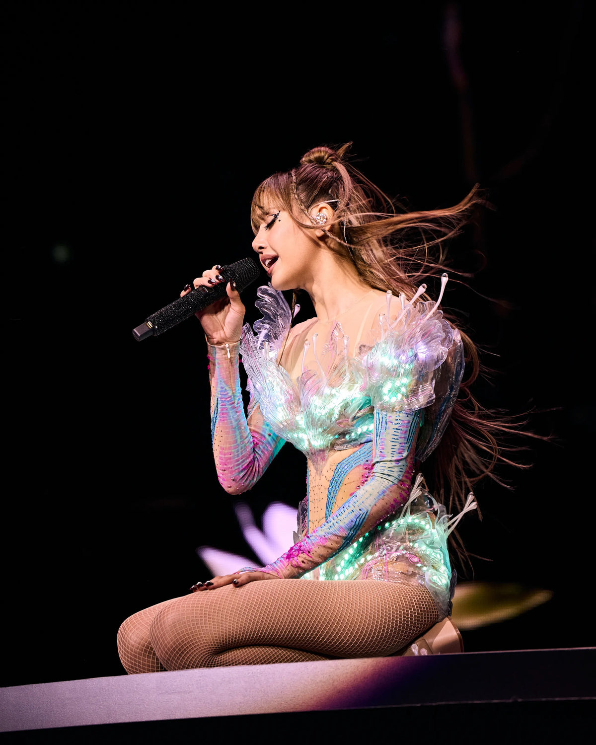
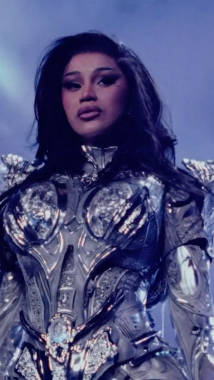
The atelier built its name dressing the artists and celebrities the world watches. The same hands and the same methods make every piece, including yours.
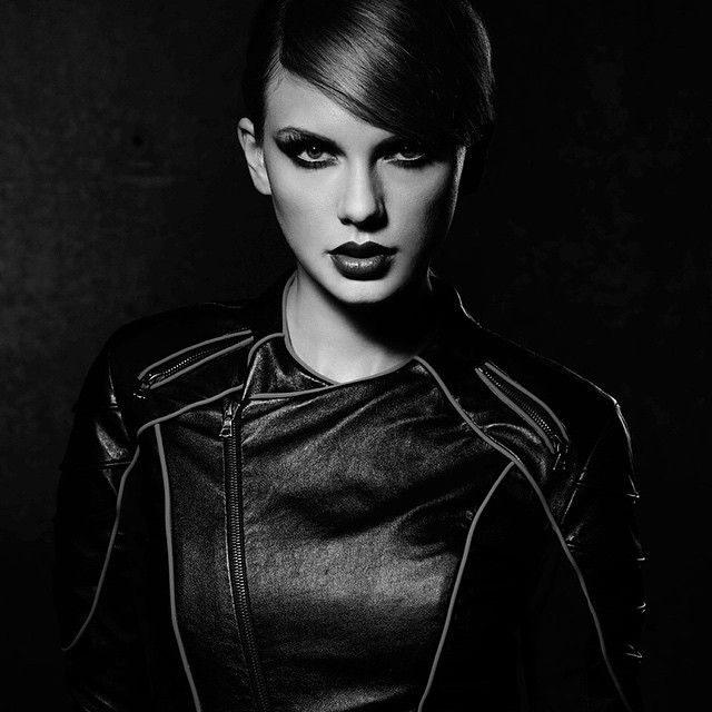
TaylorSwift_BadBlood_AL.jpg

Taylor Swift

62fcbe25c924-doja-cat.jpg.webp

Doja Cat

GDM_1619.jpeg

Lisa

b9a4dcfb-55e7-42a2-b877-93a8989a0d80-original.jpg

Cardi B

Once made exclusively for celebrities. Now available to everyone.

.al-product-story-section { --al-line: rgba(var(--color-foreground), 0.2); position: relative; isolation: isolate; overflow: hidden; background: rgb(var(--color-background)); color: rgb(var(--color-foreground)); } .al-product-story-section * { box-sizing: border-box; } .al-richtext > * { margin-top: 0; } .al-richtext > *:last-child { margin-bottom: 0; } .al-story-page { max-width: 1440px; margin: 0 auto; padding-inline: 40px; } .al-section-content { position: relative; z-index: 1; } .al-section-background { position: absolute; z-index: 0; inset: 0; pointer-events: none; overflow: hidden; background: var(--al-bg-color); } .al-section-background img, .al-section-background video { width: 100%; height: 100%; display: block; object-fit: var(--al-bg-fit); object-position: var(--al-bg-position); } .al-section-background::after { content: ""; position: absolute; inset: 0; background: var(--al-overlay-color); opacity: var(--al-overlay-opacity); } .al-eyebrow { margin: 0; text-transform: uppercase; letter-spacing: .17em; font-size: 9px; } .al-eyebrow > *,.al-story-label > *,.al-story-value > *,.al-media-caption > * { margin: 0; } .al-story-heading { font-family: var(--font-heading-family); font-style: var(--font-heading-style); font-weight: var(--font-heading-weight); font-size: clamp(42px, 5vw, 72px); line-height: .95; letter-spacing: -.04em; margin: 18px 0 28px; color: inherit; } .al-story-heading > * { margin: 0; font: inherit; letter-spacing: inherit; line-height: inherit; } .al-story-rte { max-width: 560px; color: rgba(var(--color-foreground), .74); font-size: 14px; line-height: 1.72; } .al-story-rte p { margin: 0; } .al-story-label { display: block; text-transform: uppercase; letter-spacing: .13em; font-size: 9px; margin-bottom: 8px; } .al-scroll-segment { height: 430vh; overflow: visible; } .al-scroll-sticky { position: sticky; z-index: 1; top: 0; height: 100vh; height: 100svh; overflow: hidden; background: rgb(var(--color-background)); } .al-scroll-segment.al-has-custom-bg .al-scroll-sticky { background: transparent; } .al-scroll-stage { position: absolute; inset: 0; opacity: 0; transform: scale(1.02); will-change: opacity, transform; } .al-scroll-pair { display: grid; grid-template-columns: 1fr 1fr; width: 100%; height: 100%; } .al-scroll-video,.al-scroll-fallback { width: 100%; height: 100%; display: block; object-fit: cover; } .al-scroll-shade { position: absolute; inset: 0; background: linear-gradient(180deg, rgba(0,0,0,.2), rgba(0,0,0,.04) 35%, rgba(0,0,0,.1) 68%, rgba(0,0,0,.5)); pointer-events: none; } .al-scroll-copy { position: absolute; z-index: 2; inset: 0; display: grid; place-items: center; text-align: center; padding: 32px; } .al-scroll-heading { font-family: var(--font-heading-family); font-size: clamp(46px,6vw,90px); line-height: .92; letter-spacing: -.045em; margin: 0 0 22px; color: inherit; text-shadow: 0 2px 26px rgba(0,0,0,.5); } .al-scroll-heading > *,.al-scroll-kicker > *,.al-scroll-subline > *,.al-scroll-hint > * { margin: 0; font: inherit; letter-spacing: inherit; line-height: inherit; } .al-scroll-kicker,.al-scroll-subline,.al-scroll-hint { text-transform: uppercase; letter-spacing: .17em; font-size: 9px; } .al-scroll-kicker { margin: 0 0 20px; }.al-scroll-subline { margin: 0; } .al-scroll-hint { position: absolute; z-index: 3; bottom: 26px; left: 50%; transform: translateX(-50%); opacity: .72; white-space: nowrap; } .al-editorial-section { padding: 96px 0; } .al-editorial-grid { display: grid; grid-template-columns: .75fr 1.25fr; gap: 70px; align-items: center; } .al-editorial-media { height: min(72vw,820px); position: relative; background: rgba(var(--color-foreground),.05); overflow: hidden; } .al-editorial-media img { width: 100%; height: 100%; object-fit: contain; padding: 5%; } .al-media-caption { position: absolute; right: 22px; bottom: 22px; background: rgba(var(--color-background),.88); padding: 12px 14px; text-transform: uppercase; letter-spacing: .13em; font-size: 8px; } .al-fact-grid { display: grid; grid-template-columns: repeat(3,1fr); border-top: 1px solid var(--al-line); margin-top: 42px; } .al-fact-grid > div { padding: 18px 14px 0 0; border-right: 1px solid var(--al-line); } .al-fact-grid > div + div { padding-left: 14px; }.al-fact-grid > div:last-child { border-right: 0; } .al-fact-grid .al-story-value { font-size: 11px; color: rgba(var(--color-foreground),.72); } .al-feature-grid { min-height: 880px; display: grid; grid-template-columns: .82fr 1.18fr; } .al-feature-copy { padding: 105px 62px 105px max(40px,calc((100vw - 1440px)/2 + 40px)); display: flex; flex-direction: column; justify-content: center; } .al-feature-media { position: relative; overflow: hidden; background: #111; } .al-feature-media > img,.al-feature-media > video { width: 100%; height: 100%; display: block; object-fit: cover; filter: brightness(.72) contrast(1.08); } .al-feature-media::after { content: ""; position: absolute; inset: 0; background: linear-gradient(90deg, rgba(var(--color-background),1), transparent 40%); } .al-feature-details { display: flex; gap: 34px; flex-wrap: wrap; border-top: 1px solid var(--al-line); padding-top: 20px; margin-top: 34px; } .al-feature-details .al-story-value { font-size: 11px; color: rgba(var(--color-foreground),.68); } .al-feature-badge { position: absolute; z-index: 2; width: min(var(--al-badge-width,200px),42vw); transform: rotate(var(--al-badge-rotation,0deg)); } .al-feature-badge--bottom-right { right: 7%; bottom: 8%; }.al-feature-badge--bottom-left { left: 7%; bottom: 8%; }.al-feature-badge--top-right { right: 7%; top: 8%; }.al-feature-badge--top-left { left: 7%; top: 8%; } .al-feature-badge--text { aspect-ratio: 1; border: 1px solid rgba(var(--color-foreground),.42); border-radius: 50%; display: grid; place-items: center; padding: 14px; text-align: center; text-transform: uppercase; letter-spacing: .14em; font-size: 8px; } .al-feature-badge--image { isolation: isolate; } .al-feature-badge--image img { display: block; width: 100%; height: auto; object-fit: contain; } .al-feature-badge-label { position: absolute; z-index: 1; top: 50%; left: 50%; width: 72%; transform: translate(-50%,calc(-50% + var(--al-badge-text-offset,0px))); color: var(--al-badge-text-color,#fff); font-size: var(--al-badge-text-size,11px); line-height: 1.15; text-align: center; text-transform: uppercase; letter-spacing: .14em; } .al-craft-grid { display: grid; grid-template-columns: 1fr 1fr; min-height: 820px; } .al-craft-image { overflow: hidden; background: #111; }.al-craft-image img { width: 100%; height: 100%; object-fit: cover; transform: scale(1.35); filter: grayscale(1) contrast(1.15) brightness(.62); } .al-craft-copy { padding: 96px max(40px,calc((100vw - 1440px)/2 + 40px)) 96px 76px; display: flex; flex-direction: column; justify-content: center; } .al-detail-list { list-style: none; padding: 0; margin: 36px 0 0; border-top: 1px solid var(--al-line); } .al-detail-list li { display: grid; grid-template-columns: 135px 1fr; gap: 24px; padding: 15px 0; border-bottom: 1px solid var(--al-line); } .al-detail-list li .al-story-value { font-size: 12px; color: rgba(var(--color-foreground),.72); } .al-details-section,.al-release-section { padding: 100px 0; } .al-section-head { display: grid; grid-template-columns: .82fr 1.18fr; gap: 70px; align-items: end; } .al-spec-grid { display: grid; grid-template-columns: repeat(6,1fr); border-block: 1px solid var(--al-line); margin-top: 56px; } .al-spec-grid > div { padding: 22px 18px; border-right: 1px solid var(--al-line); min-height: 104px; }.al-spec-grid > div:last-child { border-right: 0; }.al-spec-grid .al-story-value { font-size: 12px; } .al-release-grid { display: grid; grid-template-columns: repeat(3,1fr); margin-top: 58px; border-top: 1px solid var(--al-line); } .al-release-grid article { padding: 28px 28px 30px 0; border-bottom: 1px solid var(--al-line); }.al-release-grid article + article { padding-left: 28px; border-left: 1px solid var(--al-line); } .al-release-title { font-family: var(--font-heading-family); font-size: 25px; line-height: 1.08; margin: 0 0 16px; color: inherit; }.al-release-title > * { margin: 0; font: inherit; line-height: inherit; }.al-release-copy { font-size: 12px; color: rgba(var(--color-foreground),.72); } .al-delivery-grid { display: grid; grid-template-columns: repeat(3,1fr); margin-top: 36px; border: 1px solid var(--al-line); background: rgba(var(--color-foreground),.04); } .al-delivery-grid > div { padding: 20px 22px; border-right: 1px solid var(--al-line); }.al-delivery-grid > div:last-child { border-right: 0; }.al-delivery-grid .al-story-value { font-size: 11px; color: rgba(var(--color-foreground),.72); } .al-inquiry-section { min-height: 92vh; display: grid; grid-template-columns: minmax(0,.9fr) minmax(0,1.1fr); background: var(--inq-bg); color: var(--inq-text); } .al-inquiry-copy { padding: clamp(70px,8vw,140px) clamp(28px,6vw,100px); display: flex; flex-direction: column; justify-content: center; } .al-inquiry-heading { font-family: var(--font-heading-family); font-size: clamp(48px,6.2vw,96px); line-height: .88; letter-spacing: -.055em; margin: 18px 0 30px; max-width: 760px; color: var(--inq-text); }.al-inquiry-heading > * { margin: 0; font: inherit; letter-spacing: inherit; line-height: inherit; } .al-inquiry-body { color: var(--inq-muted); font-size: 14px; line-height: 1.65; max-width: 560px; }.al-inquiry-form { margin-top: 42px; max-width: 680px; }.al-inquiry-fields { display: grid; grid-template-columns: 1fr 1fr; gap: 18px; } .al-inquiry-form label { display: block; margin-bottom: 18px; }.al-inquiry-form label span { display: block; text-transform: uppercase; letter-spacing: .14em; font-size: 8px; margin-bottom: 8px; } .al-inquiry-form input,.al-inquiry-form textarea { width: 100%; border: 0; border-bottom: 1px solid color-mix(in srgb,var(--inq-text) 35%,transparent); background: transparent; color: var(--inq-text); padding: 10px 0; border-radius: 0; font: inherit; } .al-inquiry-form input:focus,.al-inquiry-form textarea:focus { outline: 0; border-color: var(--inq-accent); } .al-inquiry-form button { width: 100%; margin-top: 8px; background: var(--inq-accent); color: var(--inq-bg); border: 1px solid var(--inq-accent); padding: 20px 22px; display: flex; justify-content: space-between; text-transform: uppercase; letter-spacing: .14em; font-size: 10px; cursor: pointer; } .al-inquiry-product { margin: 14px 0 0; color: var(--inq-muted); text-transform: uppercase; letter-spacing: .12em; font-size: 8px; }.al-inquiry-success { border: 1px solid var(--inq-accent); padding: 15px; margin-bottom: 20px; } .al-inquiry-visuals { position: relative; min-height: 880px; background: #111; }.al-inquiry-image { position: absolute; overflow: hidden; }.al-inquiry-image img { width: 100%; height: 100%; object-fit: cover; filter: grayscale(1) contrast(1.08); } .al-inquiry-image--studio { inset: 0 0 0 12%; clip-path: polygon(12% 0,100% 0,100% 100%,0 100%); }.al-inquiry-image--portrait { z-index: 2; left: 0; bottom: 7%; width: 42%; height: 55%; border: 1px solid color-mix(in srgb,var(--inq-text) 35%,transparent); transform: translateX(-9%) rotate(-2deg); } @media (max-width: 990px) { .al-story-page { padding-inline: 22px; } .al-editorial-grid,.al-feature-grid,.al-craft-grid,.al-section-head,.al-inquiry-section { grid-template-columns: 1fr; } .al-editorial-grid { gap: 42px; }.al-feature-copy,.al-craft-copy { padding: 78px 24px; }.al-feature-media,.al-craft-image { min-height: 620px; } .al-spec-grid { grid-template-columns: repeat(3,1fr); }.al-release-grid { grid-template-columns: 1fr; }.al-release-grid article + article { padding-left: 0; border-left: 0; } .al-scroll-pair { grid-template-columns: 1fr; }.al-scroll-video--echo { display: none; } .al-inquiry-visuals { min-height: 700px; order: -1; }.al-inquiry-copy { padding: 72px 24px; } } @media (max-width: 620px) { .al-scroll-segment { height: 390vh; }.al-editorial-section,.al-details-section,.al-release-section { padding: 74px 0; }.al-editorial-media { height: 520px; }.al-feature-media,.al-craft-image { min-height: 500px; } .al-fact-grid,.al-delivery-grid { grid-template-columns: 1fr; }.al-fact-grid > div,.al-fact-grid > div + div,.al-delivery-grid > div { padding: 16px 0; border-right: 0; border-bottom: 1px solid var(--al-line); } .al-spec-grid { grid-template-columns: 1fr 1fr; }.al-spec-grid > div:nth-child(even) { border-right: 0; }.al-release-title { font-size: 22px; } .al-inquiry-visuals { min-height: 520px; }.al-inquiry-fields { grid-template-columns: 1fr; }.al-inquiry-image--portrait { width: 48%; height: 50%; } } @media (max-width: 749px) { .al-feature-badge { width: min(calc(var(--al-badge-width,200px) * .7),42vw); } }

07 / Pre-order gift bundles

Limited-time gift bundles.

Each pre-order tier comes with its own complimentary Asher Levine gift bundle, available only while that tier is open. Order during a tier and its bundle is yours at no extra cost. Full payment is collected at checkout.

July 2 — July 28

Deluxe ALien Gel Bag, Fallen Star Chain, Bio-Safety Deluxe Kit, and Diamond Emblem Paperweight.

July 29 — September 1 

ALien Gel Bag, Fallen Star Chain, Bio-Safety Deluxe Kit, and Diamond Emblem Paperweight.

September 2 — September 30

ALien Gel Bag, Bio-Safety Deluxe Kit, and Diamond Emblem Paperweight.

Ship by Spring 2027

Ships by Fall 2027

clientcare@asherlevine.com

Images are renders and prototype photos taken during development, shown for illustration. Final product is subject to change.

.al-product-story-section { --al-line: rgba(var(--color-foreground), 0.2); position: relative; isolation: isolate; overflow: hidden; background: rgb(var(--color-background)); color: rgb(var(--color-foreground)); } .al-product-story-section * { box-sizing: border-box; } .al-richtext > * { margin-top: 0; } .al-richtext > *:last-child { margin-bottom: 0; } .al-story-page { max-width: 1440px; margin: 0 auto; padding-inline: 40px; } .al-section-content { position: relative; z-index: 1; } .al-section-background { position: absolute; z-index: 0; inset: 0; pointer-events: none; overflow: hidden; background: var(--al-bg-color); } .al-section-background img, .al-section-background video { width: 100%; height: 100%; display: block; object-fit: var(--al-bg-fit); object-position: var(--al-bg-position); } .al-section-background::after { content: ""; position: absolute; inset: 0; background: var(--al-overlay-color); opacity: var(--al-overlay-opacity); } .al-eyebrow { margin: 0; text-transform: uppercase; letter-spacing: .17em; font-size: 9px; } .al-eyebrow > *,.al-story-label > *,.al-story-value > *,.al-media-caption > * { margin: 0; } .al-story-heading { font-family: var(--font-heading-family); font-style: var(--font-heading-style); font-weight: var(--font-heading-weight); font-size: clamp(42px, 5vw, 72px); line-height: .95; letter-spacing: -.04em; margin: 18px 0 28px; color: inherit; } .al-story-heading > * { margin: 0; font: inherit; letter-spacing: inherit; line-height: inherit; } .al-story-rte { max-width: 560px; color: rgba(var(--color-foreground), .74); font-size: 14px; line-height: 1.72; } .al-story-rte p { margin: 0; } .al-story-label { display: block; text-transform: uppercase; letter-spacing: .13em; font-size: 9px; margin-bottom: 8px; } .al-scroll-segment { height: 430vh; overflow: visible; } .al-scroll-sticky { position: sticky; z-index: 1; top: 0; height: 100vh; height: 100svh; overflow: hidden; background: rgb(var(--color-background)); } .al-scroll-segment.al-has-custom-bg .al-scroll-sticky { background: transparent; } .al-scroll-stage { position: absolute; inset: 0; opacity: 0; transform: scale(1.02); will-change: opacity, transform; } .al-scroll-pair { display: grid; grid-template-columns: 1fr 1fr; width: 100%; height: 100%; } .al-scroll-video,.al-scroll-fallback { width: 100%; height: 100%; display: block; object-fit: cover; } .al-scroll-shade { position: absolute; inset: 0; background: linear-gradient(180deg, rgba(0,0,0,.2), rgba(0,0,0,.04) 35%, rgba(0,0,0,.1) 68%, rgba(0,0,0,.5)); pointer-events: none; } .al-scroll-copy { position: absolute; z-index: 2; inset: 0; display: grid; place-items: center; text-align: center; padding: 32px; } .al-scroll-heading { font-family: var(--font-heading-family); font-size: clamp(46px,6vw,90px); line-height: .92; letter-spacing: -.045em; margin: 0 0 22px; color: inherit; text-shadow: 0 2px 26px rgba(0,0,0,.5); } .al-scroll-heading > *,.al-scroll-kicker > *,.al-scroll-subline > *,.al-scroll-hint > * { margin: 0; font: inherit; letter-spacing: inherit; line-height: inherit; } .al-scroll-kicker,.al-scroll-subline,.al-scroll-hint { text-transform: uppercase; letter-spacing: .17em; font-size: 9px; } .al-scroll-kicker { margin: 0 0 20px; }.al-scroll-subline { margin: 0; } .al-scroll-hint { position: absolute; z-index: 3; bottom: 26px; left: 50%; transform: translateX(-50%); opacity: .72; white-space: nowrap; } .al-editorial-section { padding: 96px 0; } .al-editorial-grid { display: grid; grid-template-columns: .75fr 1.25fr; gap: 70px; align-items: center; } .al-editorial-media { height: min(72vw,820px); position: relative; background: rgba(var(--color-foreground),.05); overflow: hidden; } .al-editorial-media img { width: 100%; height: 100%; object-fit: contain; padding: 5%; } .al-media-caption { position: absolute; right: 22px; bottom: 22px; background: rgba(var(--color-background),.88); padding: 12px 14px; text-transform: uppercase; letter-spacing: .13em; font-size: 8px; } .al-fact-grid { display: grid; grid-template-columns: repeat(3,1fr); border-top: 1px solid var(--al-line); margin-top: 42px; } .al-fact-grid > div { padding: 18px 14px 0 0; border-right: 1px solid var(--al-line); } .al-fact-grid > div + div { padding-left: 14px; }.al-fact-grid > div:last-child { border-right: 0; } .al-fact-grid .al-story-value { font-size: 11px; color: rgba(var(--color-foreground),.72); } .al-feature-grid { min-height: 880px; display: grid; grid-template-columns: .82fr 1.18fr; } .al-feature-copy { padding: 105px 62px 105px max(40px,calc((100vw - 1440px)/2 + 40px)); display: flex; flex-direction: column; justify-content: center; } .al-feature-media { position: relative; overflow: hidden; background: #111; } .al-feature-media > img,.al-feature-media > video { width: 100%; height: 100%; display: block; object-fit: cover; filter: brightness(.72) contrast(1.08); } .al-feature-media::after { content: ""; position: absolute; inset: 0; background: linear-gradient(90deg, rgba(var(--color-background),1), transparent 40%); } .al-feature-details { display: flex; gap: 34px; flex-wrap: wrap; border-top: 1px solid var(--al-line); padding-top: 20px; margin-top: 34px; } .al-feature-details .al-story-value { font-size: 11px; color: rgba(var(--color-foreground),.68); } .al-feature-badge { position: absolute; z-index: 2; width: min(var(--al-badge-width,200px),42vw); transform: rotate(var(--al-badge-rotation,0deg)); } .al-feature-badge--bottom-right { right: 7%; bottom: 8%; }.al-feature-badge--bottom-left { left: 7%; bottom: 8%; }.al-feature-badge--top-right { right: 7%; top: 8%; }.al-feature-badge--top-left { left: 7%; top: 8%; } .al-feature-badge--text { aspect-ratio: 1; border: 1px solid rgba(var(--color-foreground),.42); border-radius: 50%; display: grid; place-items: center; padding: 14px; text-align: center; text-transform: uppercase; letter-spacing: .14em; font-size: 8px; } .al-feature-badge--image { isolation: isolate; } .al-feature-badge--image img { display: block; width: 100%; height: auto; object-fit: contain; } .al-feature-badge-label { position: absolute; z-index: 1; top: 50%; left: 50%; width: 72%; transform: translate(-50%,calc(-50% + var(--al-badge-text-offset,0px))); color: var(--al-badge-text-color,#fff); font-size: var(--al-badge-text-size,11px); line-height: 1.15; text-align: center; text-transform: uppercase; letter-spacing: .14em; } .al-craft-grid { display: grid; grid-template-columns: 1fr 1fr; min-height: 820px; } .al-craft-image { overflow: hidden; background: #111; }.al-craft-image img { width: 100%; height: 100%; object-fit: cover; transform: scale(1.35); filter: grayscale(1) contrast(1.15) brightness(.62); } .al-craft-copy { padding: 96px max(40px,calc((100vw - 1440px)/2 + 40px)) 96px 76px; display: flex; flex-direction: column; justify-content: center; } .al-detail-list { list-style: none; padding: 0; margin: 36px 0 0; border-top: 1px solid var(--al-line); } .al-detail-list li { display: grid; grid-template-columns: 135px 1fr; gap: 24px; padding: 15px 0; border-bottom: 1px solid var(--al-line); } .al-detail-list li .al-story-value { font-size: 12px; color: rgba(var(--color-foreground),.72); } .al-details-section,.al-release-section { padding: 100px 0; } .al-section-head { display: grid; grid-template-columns: .82fr 1.18fr; gap: 70px; align-items: end; } .al-spec-grid { display: grid; grid-template-columns: repeat(6,1fr); border-block: 1px solid var(--al-line); margin-top: 56px; } .al-spec-grid > div { padding: 22px 18px; border-right: 1px solid var(--al-line); min-height: 104px; }.al-spec-grid > div:last-child { border-right: 0; }.al-spec-grid .al-story-value { font-size: 12px; } .al-release-grid { display: grid; grid-template-columns: repeat(3,1fr); margin-top: 58px; border-top: 1px solid var(--al-line); } .al-release-grid article { padding: 28px 28px 30px 0; border-bottom: 1px solid var(--al-line); }.al-release-grid article + article { padding-left: 28px; border-left: 1px solid var(--al-line); } .al-release-title { font-family: var(--font-heading-family); font-size: 25px; line-height: 1.08; margin: 0 0 16px; color: inherit; }.al-release-title > * { margin: 0; font: inherit; line-height: inherit; }.al-release-copy { font-size: 12px; color: rgba(var(--color-foreground),.72); } .al-delivery-grid { display: grid; grid-template-columns: repeat(3,1fr); margin-top: 36px; border: 1px solid var(--al-line); background: rgba(var(--color-foreground),.04); } .al-delivery-grid > div { padding: 20px 22px; border-right: 1px solid var(--al-line); }.al-delivery-grid > div:last-child { border-right: 0; }.al-delivery-grid .al-story-value { font-size: 11px; color: rgba(var(--color-foreground),.72); } .al-inquiry-section { min-height: 92vh; display: grid; grid-template-columns: minmax(0,.9fr) minmax(0,1.1fr); background: var(--inq-bg); color: var(--inq-text); } .al-inquiry-copy { padding: clamp(70px,8vw,140px) clamp(28px,6vw,100px); display: flex; flex-direction: column; justify-content: center; } .al-inquiry-heading { font-family: var(--font-heading-family); font-size: clamp(48px,6.2vw,96px); line-height: .88; letter-spacing: -.055em; margin: 18px 0 30px; max-width: 760px; color: var(--inq-text); }.al-inquiry-heading > * { margin: 0; font: inherit; letter-spacing: inherit; line-height: inherit; } .al-inquiry-body { color: var(--inq-muted); font-size: 14px; line-height: 1.65; max-width: 560px; }.al-inquiry-form { margin-top: 42px; max-width: 680px; }.al-inquiry-fields { display: grid; grid-template-columns: 1fr 1fr; gap: 18px; } .al-inquiry-form label { display: block; margin-bottom: 18px; }.al-inquiry-form label span { display: block; text-transform: uppercase; letter-spacing: .14em; font-size: 8px; margin-bottom: 8px; } .al-inquiry-form input,.al-inquiry-form textarea { width: 100%; border: 0; border-bottom: 1px solid color-mix(in srgb,var(--inq-text) 35%,transparent); background: transparent; color: var(--inq-text); padding: 10px 0; border-radius: 0; font: inherit; } .al-inquiry-form input:focus,.al-inquiry-form textarea:focus { outline: 0; border-color: var(--inq-accent); } .al-inquiry-form button { width: 100%; margin-top: 8px; background: var(--inq-accent); color: var(--inq-bg); border: 1px solid var(--inq-accent); padding: 20px 22px; display: flex; justify-content: space-between; text-transform: uppercase; letter-spacing: .14em; font-size: 10px; cursor: pointer; } .al-inquiry-product { margin: 14px 0 0; color: var(--inq-muted); text-transform: uppercase; letter-spacing: .12em; font-size: 8px; }.al-inquiry-success { border: 1px solid var(--inq-accent); padding: 15px; margin-bottom: 20px; } .al-inquiry-visuals { position: relative; min-height: 880px; background: #111; }.al-inquiry-image { position: absolute; overflow: hidden; }.al-inquiry-image img { width: 100%; height: 100%; object-fit: cover; filter: grayscale(1) contrast(1.08); } .al-inquiry-image--studio { inset: 0 0 0 12%; clip-path: polygon(12% 0,100% 0,100% 100%,0 100%); }.al-inquiry-image--portrait { z-index: 2; left: 0; bottom: 7%; width: 42%; height: 55%; border: 1px solid color-mix(in srgb,var(--inq-text) 35%,transparent); transform: translateX(-9%) rotate(-2deg); } @media (max-width: 990px) { .al-story-page { padding-inline: 22px; } .al-editorial-grid,.al-feature-grid,.al-craft-grid,.al-section-head,.al-inquiry-section { grid-template-columns: 1fr; } .al-editorial-grid { gap: 42px; }.al-feature-copy,.al-craft-copy { padding: 78px 24px; }.al-feature-media,.al-craft-image { min-height: 620px; } .al-spec-grid { grid-template-columns: repeat(3,1fr); }.al-release-grid { grid-template-columns: 1fr; }.al-release-grid article + article { padding-left: 0; border-left: 0; } .al-scroll-pair { grid-template-columns: 1fr; }.al-scroll-video--echo { display: none; } .al-inquiry-visuals { min-height: 700px; order: -1; }.al-inquiry-copy { padding: 72px 24px; } } @media (max-width: 620px) { .al-scroll-segment { height: 390vh; }.al-editorial-section,.al-details-section,.al-release-section { padding: 74px 0; }.al-editorial-media { height: 520px; }.al-feature-media,.al-craft-image { min-height: 500px; } .al-fact-grid,.al-delivery-grid { grid-template-columns: 1fr; }.al-fact-grid > div,.al-fact-grid > div + div,.al-delivery-grid > div { padding: 16px 0; border-right: 0; border-bottom: 1px solid var(--al-line); } .al-spec-grid { grid-template-columns: 1fr 1fr; }.al-spec-grid > div:nth-child(even) { border-right: 0; }.al-release-title { font-size: 22px; } .al-inquiry-visuals { min-height: 520px; }.al-inquiry-fields { grid-template-columns: 1fr; }.al-inquiry-image--portrait { width: 48%; height: 50%; } } @media (max-width: 749px) { .al-feature-badge { width: min(calc(var(--al-badge-width,200px) * .7),42vw); } }

Private channel / Designer access

Enter the atelier.

Questions, material studies, private previews, or a conversation around this object. Send a signal directly to Asher Levine.
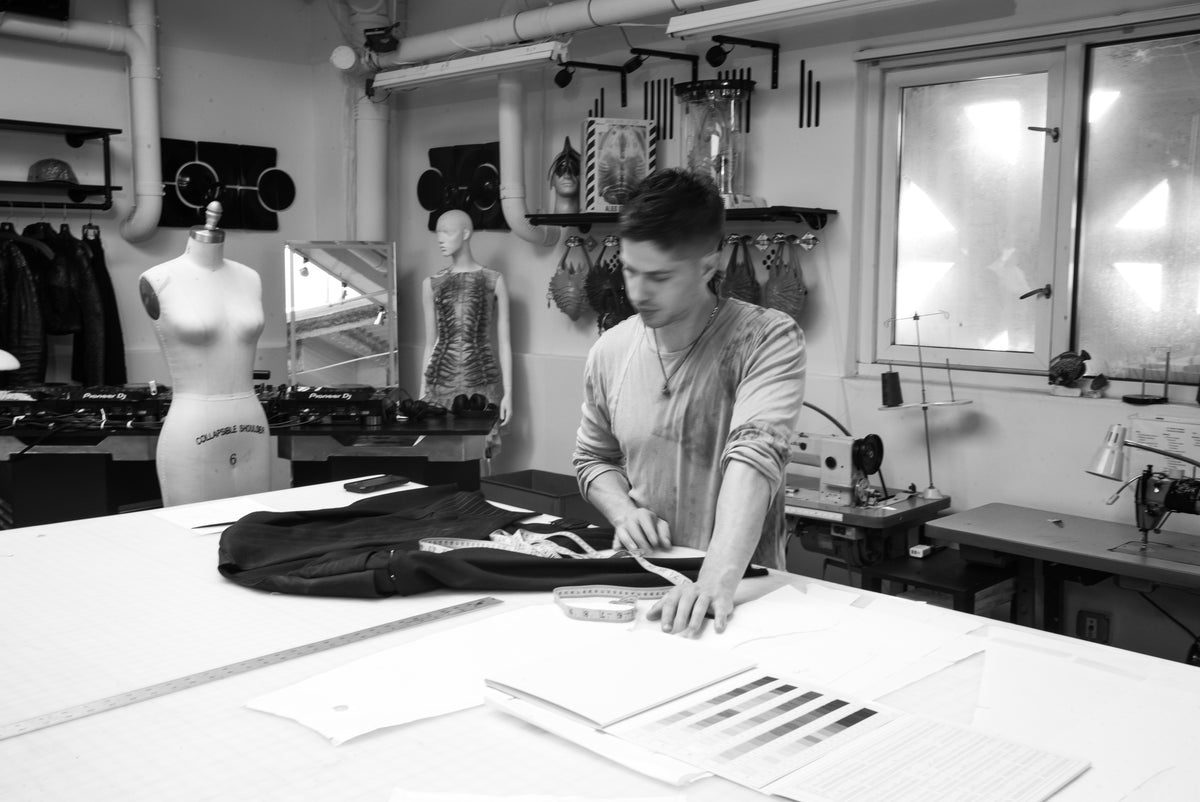
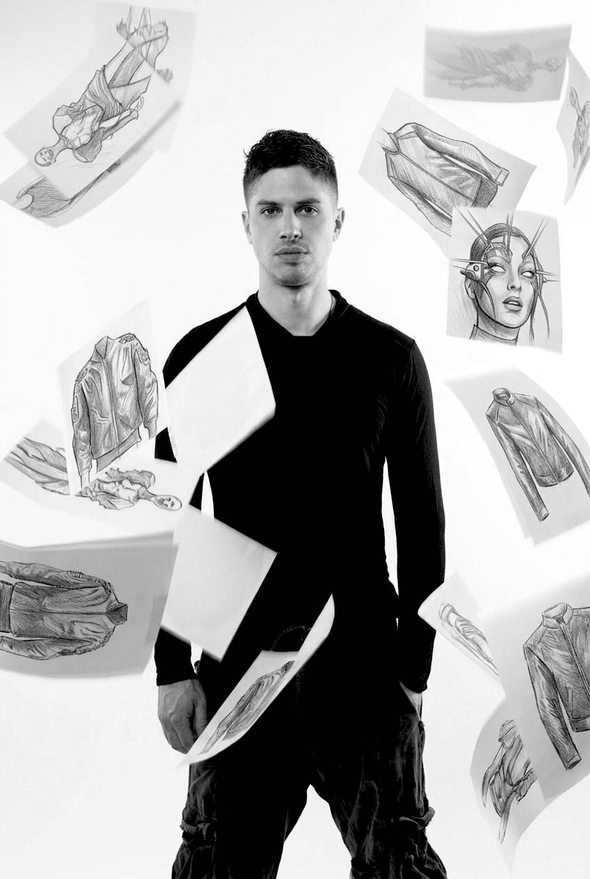
Inquiry tagged: Diamond Tote Bag

As featured in

  • Vogue
  • WWD
  • Elle
  • W Magazine
  • Hello!
  • Nylon
  • CNN
  • Paper